Journal · Brand
Jif waited 30 years to delete a drop shadow
Jif's first logo change in more than 30 years mostly deleted a drop shadow. Effects like that cost a small shop money every time the logo leaves a screen for fabric, vinyl, or glass.
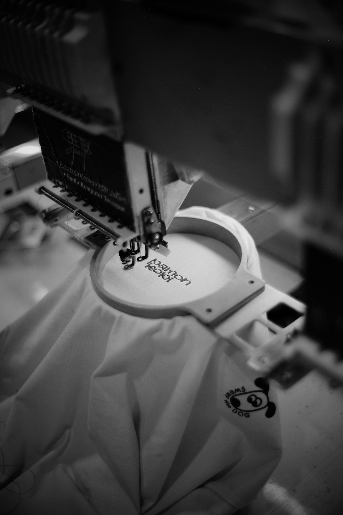
The digitizer at a print shop in Irvington keeps a folder on his desktop called "fix these first." Every file in it is a logo that showed up with a drop shadow still attached.
He is not being fussy. An embroidery machine cannot stitch a shadow. A vinyl cutter cannot cut one. So he redraws the mark by hand, adds a setup charge, and the shop owner who sent the file never learns why the invoice grew.
Jif took thirty years to reach the same conclusion.
On August 10, 2026, J.M. Smucker announced Jif's first major design update since the early nineties. The press release is blunt about what happened: the new look "revives the brand's signature tri-color banner and removes the dated drop shadow from the letters for a cleaner, bolder look that stands out both on shelves and online." Jars with the new packaging start shipping in October 2026. The recipe stayed. The stripes stayed. A shadow came off some letters.
That is the whole redesign. One of the most recognized labels in an American grocery aisle, and the big move was a subtraction.
Every effect on your logo is a bill somebody else will hand you later.
If your name is on a sign, a shirt, a cup, and a window, this is the cheapest design lesson you will get all month.
Why does a drop shadow cost money?
Your logo does not live on a screen. It lives on objects, and objects get made by machines that only understand solid shapes.
An embroidery machine lays down thread, one color at a time. Before it can do that, somebody converts your artwork into a stitch file, a process called digitizing. Corporate Casuals charges a flat $35 setup fee per logo, once, and warns that resizing elements in an existing stitch file triggers a new setup charge. So your logo on a hat front and the same logo on the back of a jacket are two files, not one. Digitizing shops quote a wide range for the work, roughly $10 to $100, and they price up for fine lines, overlapping shapes, and gradients, because a person has to make the calls your file did not make for them.
A vinyl cutter is stricter. It drags a blade through colored film, so it only produces shapes cut from solid color. A cutter cannot reproduce a gradient or a photograph at all. Your soft shadow becomes either nothing, or a second layer of vinyl that somebody weeds and aligns by hand on every single sign.
Window etching, one-color bag stamps, embossed cards, hot foil, and laser engraving all want the same thing. Solid shapes.
So the shadow you added in Canva because the mark "looked flat" gets removed by four different vendors, and all four bill you for the work.
Can your logo survive one color?
Open your logo file. Turn everything in it black. White background, black mark, nothing else.
If it still reads, you are in good shape. If it turns into a blob, or a word vanishes, or two shapes merge into one, that is the problem your sign shop has been fixing for you without saying anything.
Then do it at size. Shrink the black version to about an inch wide and print it. An inch is roughly what your logo gets on a business card, an apron, a hat front, or a to-go cup. My rule: if you cannot tell what it says at arm's length, in black, at one inch, the mark is not finished yet.
The usual offenders, in the order I run into them:
| What's on the logo | What happens when somebody makes it |
|---|---|
| Drop shadow | Vendor deletes it, or charges you for a second vinyl layer |
| Gradient fill | Nobody can cut or stitch it, so someone flattens it and guesses the color |
| Thin script letters | They break apart in embroidery and snap off during vinyl weeding |
| Outer glow or bevel | It disappears, leaving a shape you have never seen before |
| A tagline inside the mark | Turns to mush below about an inch |
| White text on a colored box | Fails the day you put it on a colored shirt |
None of this means your logo is bad. It means your logo owns one outfit and needs four.
Do you need a rebrand to fix this?
Almost certainly not, and I would talk you out of one. A rebrand is a real project with a real budget, and there are only a few honest reasons to start one. This is not one of them.
You need a small set of files instead, and any designer can build them from your existing mark in an hour or two. Ask for these by name:
- A vector file (
.svg,.ai, or.eps). This is what your sign shop and your embroiderer actually want. A PNG is a photograph of your logo. A vector is the logo. - A one-color version, all black, effects stripped out.
- A reversed version, all white, for dark shirts and dark backgrounds.
- A small-size version with the tagline removed, if your full lockup has one. That version becomes your Google profile picture, your Instagram avatar, and your favicon.
Put all four in one folder called "logo," keep it in your email, and send the whole folder every time a vendor asks for artwork. You stop paying redraw fees, and your shirts, signs, and cups finally match each other. If you paid for a logo in the last few years and did not get these, go back and ask, because a normal small-business logo package should have included them. The same goes for the typeface on your sign, which carries its own license question.
Jif did a version of this at national scale. The tri-color banner survived because it is a solid shape people recognize, and Smucker's campaign work found 85 percent of consumers can identify the brand from the red, blue and green stripes alone. The shadow did not survive, because nobody remembers a shadow.
The forty-pixel problem
There is a second reason that shadow had to go, and it applies to you harder than it applies to Jif.
Most people now meet your logo at about forty pixels wide. Your Google Business Profile picture on a phone. Your Instagram avatar. The little icon on a browser tab. The tile in a delivery app. At that size a drop shadow stops being a shadow and turns into a gray smudge on one side, which makes the whole mark look slightly out of focus without anyone knowing why.
Jif's release says the cleaner mark "stands out both on shelves and online." The online half of that sentence is the part worth stealing. Instagram learned the same thing in public this month, when thousands of people misread its new script wordmark, and Instagram has brand recognition your barbershop does not.
We build this file set for every brand we ship a site for, because we got tired of clients emailing us a PNG pulled off their own website. Send us your logo and we will tell you what is missing from it.
The digitizer in Irvington told me he can usually date a logo by what somebody layered on top of it. Bevels mean 2004. Outer glow means 2011. A soft gray shadow under flat letters means someone opened a design app recently and felt like the mark needed one more thing. He fixes it, charges the setup fee, and never mentions it. You are allowed to just ask him.
Sources
| # | Source | What it backed up |
|---|---|---|
| 1 | Jif Unveils First Major Brand Refresh in More than 30 Years | The August 10, 2026 announcement, the removed drop shadow, the revived tri-color banner, and the October 2026 shipping date. |
| 2 | Jif's new campaign reworks logo to go beyond peanut butter and jelly | The finding that 85 percent of consumers recognize Jif by its red, blue and green stripes. |
| 3 | Vinyl cutter | Cutters only produce shapes cut from solid color, and gradients and photographs cannot be reproduced. |
| 4 | Embroidery setup (digitizing) charges explained | The $35 one-time setup fee per logo, and that resizing elements in an existing stitch file triggers a new charge. |
| 5 | Logo digitizing for embroidery: a guide to costs and pricing | The roughly $10 to $100 digitizing range, and that fine lines, overlapping elements and gradients raise the price. |
| 6 | How much a logo costs in 2026 | What a small-business logo package should include for the money. |