Journal · Brand
Pentagram's gala posters: give the date plain type
For a small-business event poster, use expressive type for the name and plain type for the date, then repeat those details as text on your website.
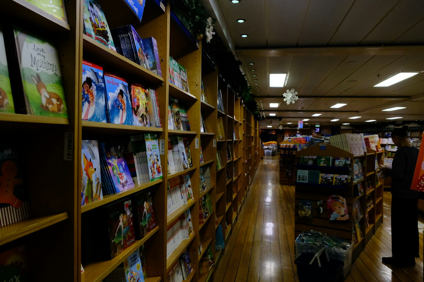
I love a spooky bookstore poster until I have to squint at the start time.
Picture an owner-run bookstore in Zionsville planning an October author night. Purple lettering suits a mystery reading. Set the date in that same tangled script, though, and a customer may have to step up to the glass to work out whether they can come. I would give the event name the fancy letters and put the details in a plain, readable font.
Pentagram's October 8, 2026 case study for Storefront Gala 2026 offers a lovely example. Natasha Jen's team built colorful lettering from the Grand Central Oyster Bar's sign, then used smaller sans serif type for event information. Sans serif means letters without the little finishing strokes you see in a font like Georgia. The gala happened on September 28; October 8 is the publication date.
What can a shop borrow from the gala posters?
In Pentagram's project, the designers use the bold custom letters across posters and digital announcements. They keep the information around those letters in a different style. I like that division of work: you can enjoy the lettering and still find the details.
You do not need a custom alphabet to try this. Choose one expressive font for the event name and one readable font for everything a guest needs to act on. Use fonts you have permission to use for the project.
For the hypothetical Zionsville reading, I might set "An evening of mysteries" in a chunky purple serif. Under it, I would put the author's name and the date in dark, plain type on a light panel. Leave enough room for "Reading starts at 6 p.m." and "Free admission; reserve a seat."
My earlier piece on what your font says about your shop covers choosing lettering that fits the business. For an event, I also want a customer to tell me the practical details after a glance.
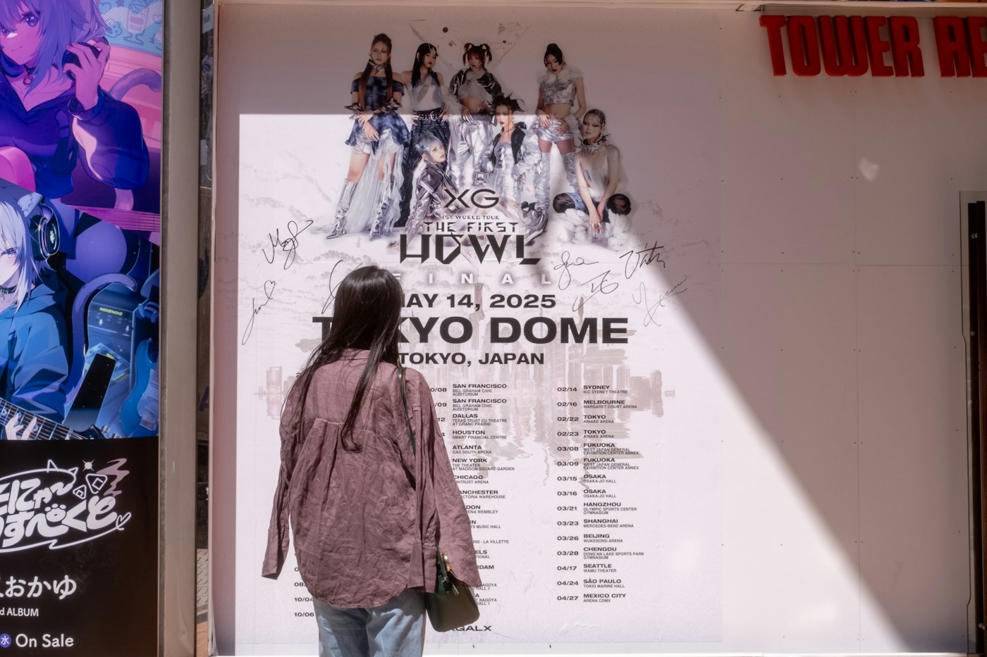
Which details should someone find first?
Give the date and start time a place together. Put the price nearby, including "free" if you charge nothing. A customer deciding whether to bring a friend should not have to scan six corners of the poster.
Imagine a Speedway brewery promoting Thursday trivia. You can set "Trivia night" in cheerful, oversized letters. Beneath it, use a simple details block: "Thursday, October 22. Questions start at 7 p.m. Free entry. Teams of up to six."
Include the team limit so a group of eight can decide whether to split into two teams before arriving. Remove a decorative slogan if you need room for information your guests will use.
I would avoid laying the start time over a photograph of the taproom. The stools and reflections can make the letters hard to pick out. A solid patch of color gives you a predictable background. Our piece on light gray text and readability shows the same problem on websites.
How should the poster work on your website?
Upload the poster if you want customers to see the artwork. Also type the date, time and admission details into the page beside the booking button. Keep the wording consistent with the printed version.
The W3C's images-of-text guidance explains that readers can resize actual text without the distortion they can get from enlarging an image. Your customer should be able to enlarge the event details without zooming into a whole poster.
We take that approach in our website work: choose type that suits the business, then check the page on a phone. A beautiful announcement needs a booking page you can read while you're making plans.
Print one copy before ordering fifty
Print the draft at the size you intend to display. Tape it where it will hang and stand where a customer would stand. You cannot judge how a poster will read through a shop window from a 200-percent view on your laptop.
Before you print fifty copies, ask someone who has not seen the draft to find the start time and ticket price.
If they hesitate, enlarge the details or move them onto a quieter background. On the website, ask them to find the same information and reach the booking screen. You can catch a problem before you pay for a stack of prints.
For the mystery reading, I would keep the purple title and set the date in type you can read from the sidewalk.
Sources
| # | Source | What it backed up |
|---|---|---|
| 1 | Pentagram news | October 8, 2026 publication date for the Storefront Gala case study. |
| 2 | Storefront Gala 2026, Pentagram | Custom display lettering, smaller sans serif event information, applications and September 28 event date. |
| 3 | Images of text, W3C WAI | Readers can resize actual text without the image distortion described in the guidance. |
| 4 | What your font says, Luminest | Related advice on choosing typography for an independent business. |
| 5 | Light gray text, Luminest | Related discussion of text contrast and readability on phones. |
| 6 | Bookstore photo, concert poster photo, design desk photo | Illustrative photographs by Roman Kravtsov, Dao En Wong and Mariah Krafft; these photos show other locations. |