Journal · Brand
Instagram redesigned itself for the first time in a decade
Instagram rebuilt its whole visual identity this month, its first real redesign in over ten years, and the new system rewards raw, handmade-looking photos over polished ones.
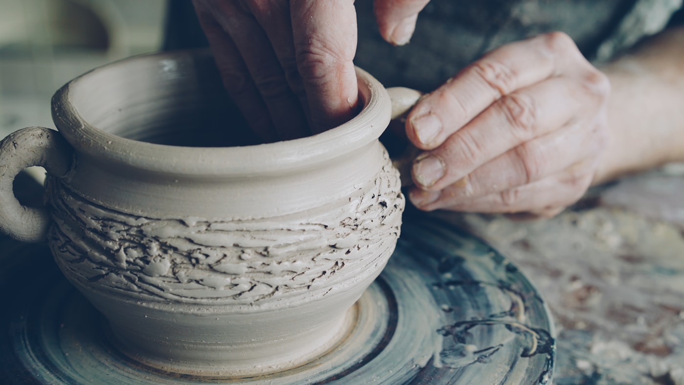
Dana runs a ceramics studio out of a converted garage in Garfield Park. Most weeks she posts two kinds of photos: a glazed shelf shot, lit carefully, camera on a tripod. And a fifteen-second video of a bowl going lopsided on the wheel before she catches it and pulls it straight.
The lopsided video gets three times the views of the glazed shot. Every time, for over a year now.
She figured that was Instagram being Instagram. As of two weeks ago, the platform agrees with her officially.
What changed
On August 13, Meta's design team published Instagram's first full brand overhaul in more than ten years. The script wordmark survived, redrawn bolder and simpler, but the team behind it seriously considered killing it. Cynthia Pratomo, Instagram's director of brand design, told It's Nice That the internal tests without script left the brand feeling like a stranger.
"Every time we stripped out the script, we became unrecognisable to ourselves. Walking away from it entirely felt like walking away from the unique qualities of who we are."
The sunset gradient, previously the dominant background color on nearly everything Instagram touched, got dialed way back. It now shows up more like a light leak on film than a wash of color. Three new typefaces round out the system: a refreshed Instagram Sans, a new Instagram Mono, and a handwriting face called Instagram Pen, built by testing pencils and ink pens against dozens of writing styles. The whole visual language borrows from contact sheets, registration marks, and darkroom annotations, the actual tools of a photo before it's polished. Meta calls it "a well-designed sketchbook." The wordmark is rolling out globally now; the rest of the system follows through the year.
Does your shop need to do anything about it?
Mostly, no. This is Instagram's own branding: the app icon, the marketing pages, the in-app chrome. Nothing about your business profile requires action, and nothing broke.
What's worth paying attention to is the reasoning Meta gave in public. Instagram's design leads said the new system exists to "actively champion everyday creativity and make imperfection feel totally normal." That's not marketing filler. It lines up exactly with what Instagram's own algorithm has been doing since Adam Mosseri called 2026 "the year of raw content" in his end-of-year note last December: unscripted, process-heavy video consistently outranks staged product photography now. I wrote about why the unpolished photo keeps beating the polished one back in June, and this rebrand is Meta putting that preference into its own style guide, not just its ranking code.
What's worth borrowing this week
Two things, concretely.
First, stop treating the process shot as the backup content. If you're a bakery, the loaf that didn't rise right is more useful to post than the perfect one. If you're a mechanic, the fifteen-second clip of a part coming apart on the bench beats the finished car every time. Your customers already know this. Now the platform's design team has said it out loud.
Second, when Instagram Pen rolls out in Stories and Reels text tools, use it for the stuff that used to live on a chalkboard: today's specials, a closing early note, a thank-you to a regular. A butcher counter on Mass Ave doing this over a photo of the case looks a lot closer to a hand-lettered sign than a stock caption, and that's the whole point of the new system. Fonts are never just decoration. I've made that case before when breaking down what your font is saying, and Instagram spent a year building a typeface to prove it.
If your grid still looks like it's arguing with your actual shop, that's a half-hour conversation, not a redesign. We do that kind of audit regularly over at our services page.
Dana already knew all of this. Instagram just wrote it into their style guide.
Sources
| # | Source | What it backed up |
|---|---|---|
| 1 | Built to celebrate creativity: the new Instagram brand identity | Official Meta Design blog post, August 13, 2026: the new wordmark, gradient treatment, and three new typefaces including Instagram Pen. |
| 2 | "Instagram has evolved": the process and craft behind Instagram's first major refresh in over ten years | Interview with Instagram's Christy Silva and Cynthia Pratomo on the "sketchbook" concept, contact-sheet visual language, and the wordmark quote. |
| 3 | Instagram, as we know it, is dead: where is Instagram headed next? | Adam Mosseri's "year of raw content" framing and the shift toward unpolished, process-driven video outranking staged photography. |