Journal · Brand
Why everything started looking bolder and what your shop should steal
Google's 2025 Material 3 Expressive update trained customers to expect bolder, heavier type everywhere. If your shop's sign still uses thin script or pale lettering, it now reads as dated.
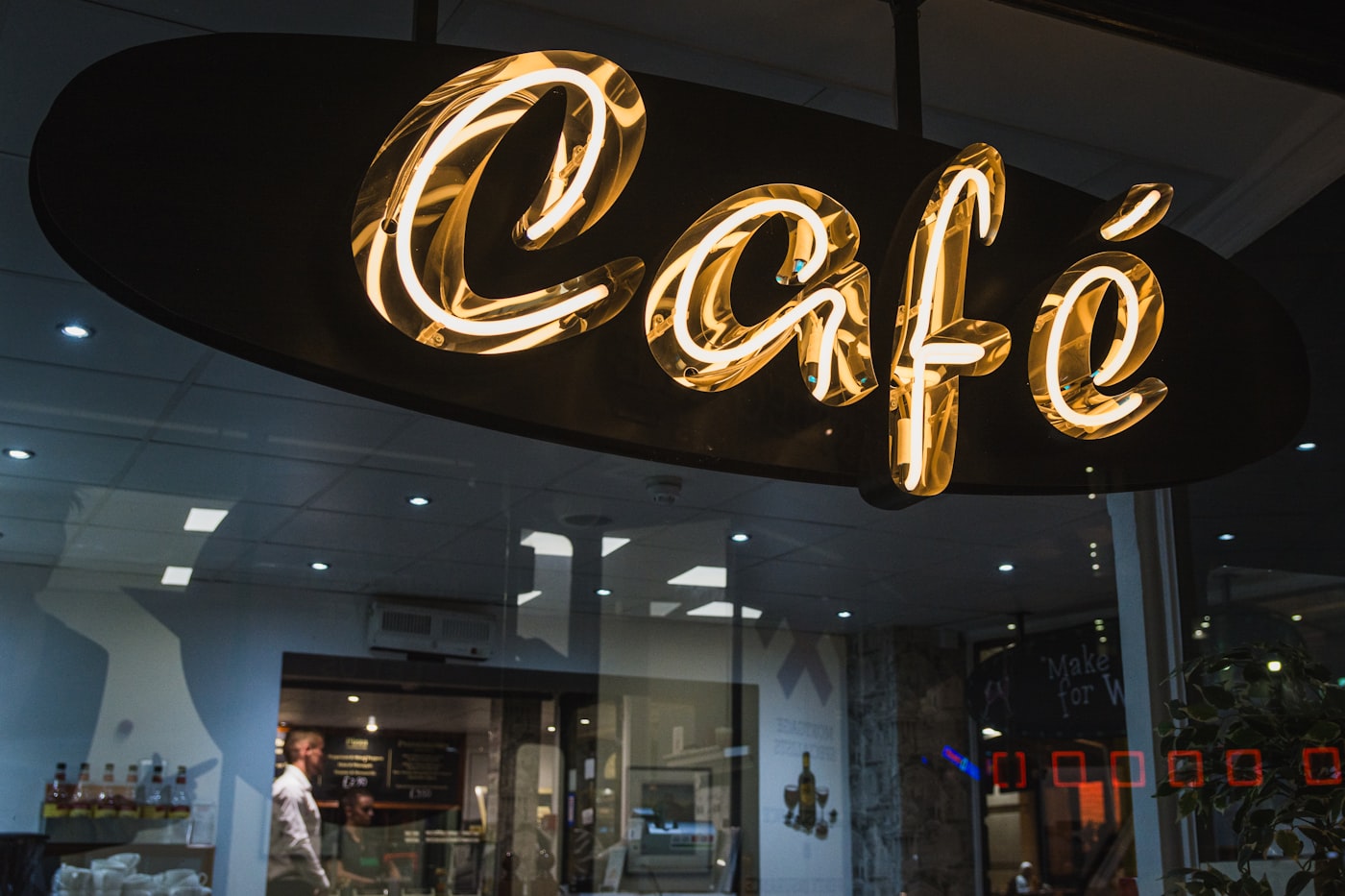
I walked past two shops on Crawfordsville Road in Speedway last month. They're two doors apart. Both sell something people want.
The first one had a deep navy wooden sign with blocky gold letterforms. Heavy. The kind of type that reads from a moving car. The second had a vinyl sign in pale gray thin sans-serif. Not a bad logo. Just quiet. So quiet it almost did not register.
The first one opened six months ago. The second one has been there for four years.
I thought about that for the rest of the drive home.
What just shifted in design
In May 2025, Google introduced Material 3 Expressive, the biggest redesign of Android's visual language since Material You. It's been rolling out to phones ever since, and by early 2026 it's running on the majority of Android devices in the wild.
What changed: everything got heavier, bolder, and more expressive.
Headlines are larger. Buttons have more visual weight. Shapes are rounded in a specific, considered way. Motion became more organic, with spring-like responses that feel alive. Typography got bigger, with heavier weights used for anything important.
Google backed this with 46 user studies and more than 18,000 participants. What they found was that expressive, bolder design made key things easier to spot, not harder. Older users could identify important elements just as fast as younger users across ten tested apps. Expressive typography improved clarity, not just personality.
This is a meaningful shift. For the last decade, the design world ran on "less is more." Thin fonts. Lots of white space. Understated everything. The prestige signal was minimalism.
That era is not dead. But the leading edge has moved.
Why your phone shapes what your customers see
Your customers are not reading design blogs. But they're spending six to eight hours a day looking at their phone screen. That trains their eyes whether they know it or not.
When every app on their phone just got heavier, bolder typography and more expressive shape design, the contrast between that and your thin Helvetica sign becomes noticeable. Not consciously. Just as a feeling that something looks a little dated.
Apple has been doing the same thing for two years. Rounded corners, vibrant color, strong hierarchy in everything they ship. Instagram and TikTok shifted their own interface aesthetics in the same direction.
The cumulative effect is that customers' visual expectations have quietly recalibrated.
The typeface on your sign is doing work you never assigned it. It's telling people when you last thought about how you look.
What this looks like in practice
You do not need to rebrand. This is not an argument for spending $5,000 on a logo redesign.
What I am talking about is one specific thing: the weight and presence of the type on your most-visible printed or physical piece. That might be your window sign. Your sidewalk chalkboard. Your paper menu. The printed header on your wall. Your business card.
A sandwich shop in SoBro I visited last spring reprinted their menus in January. They switched from a light Garamond to a bold version of the same family. Same typeface. One weight change. The menu now reads from across the counter. Before, you had to lean in.
A dry cleaner in Irvington replaced their vinyl sign last summer. Same dark background they always had, but they went from the thin version of their font to the semi-bold. Same colors, same layout. The sign now stops people.
In both cases, the owners did not know anything about Material 3 Expressive. They just knew something felt off about the old version. Turns out their instincts were catching the same shift Google spent two years of research confirming.
What you should check
Walk outside your shop and read your sign from the distance a passing customer would see it. If you have to squint to read the words, that's your answer.
Then check your paper menu or printed materials. Put them on a table and step back four feet. If the text disappears into the background, the type is too thin.
If your sign or menu uses a script font with thin strokes, pay attention to how it reads on a gray overcast day or from a car window. Thin scripts do not hold up in low-contrast situations. They look romantic in Instagram close-ups and invisible from the curb.
The range of what it costs to fix:
- Reprint a paper menu with heavier type: $40 to $120 at FedEx Office or a local print shop
- New vinyl sign text only (same substrate, new lettering): $80 to $250 depending on size
- New A-frame chalkboard lettering done yourself: cost of chalk markers
- Full sign replacement: $300 to $2,000 depending on material and size
You do not have to do all of these. Pick the one piece of physical material that the most people see in the first ten seconds of encountering your business. Update that one first.
What your shop can borrow from a $100M redesign
Google's research team spent two years figuring out what makes a visual design feel current and clear at the same time. Their answer: give important things more visual weight. Do not make people hunt.
That's the principle. What's the most important piece of information on your sign? Make it bigger, heavier, and higher contrast. Not flashier. Just more present.
The navy sign in Speedway I mentioned at the top: the shop name is set in a typeface with thick strokes and generous letter-spacing. It reads at 40 miles per hour. That was not an accident. And it cost about $300 to make.
A well-executed sign is not expensive. It's intentional.
Sources
| # | Source | What it backed up |
|---|---|---|
| 1 | Material 3 Expressive deep dive — Android Authority | Typography changes, rollout timeline, research scope (46 studies, 18,000+ participants). |
| 2 | Google launches Material 3 Expressive — Google Blog | Official announcement of the visual language shift. |
| 3 | Google ushers in age of expressive interfaces — Dezeen | Context on the broader design shift away from minimalism. |
| 4 | Top branding and design trends for 2026 — The Branding Journal | Industry-wide confirmation of the expressive/bold design trend. |
| 5 | Handmade designs: the new trust signal — Nielsen Norman Group | User research on expressive, human-leaning visual design building trust. |
All sign and printing prices are approximate as of May 2026 and vary by vendor.