Journal · Brand
What your sign is saying before anyone reads it
Your outdoor sign communicates your shop's character before anyone reads the words. Color, condition, and material are doing design work you didn't deliberately assign them.
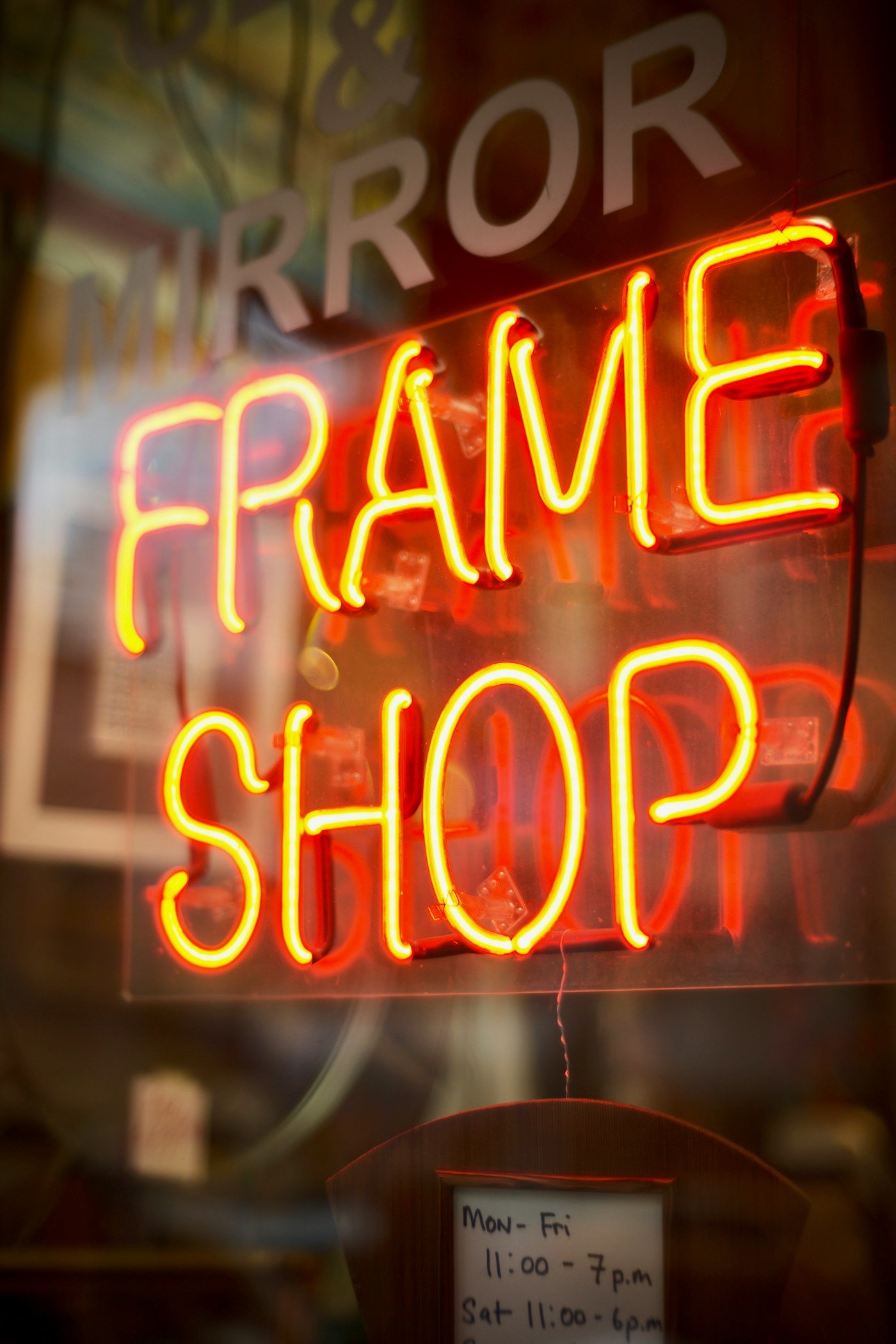
I walked past two nail salons in Broad Ripple on a Thursday evening last month. Same block. Same price range.
One had a warm amber sign with a loose script typeface and a couple of pendant lights glowing in the window. The other had white vinyl on a backlit panel, the name in a tight geometric sans-serif.
I went into the first one. I hadn't heard anything from anyone about which was better. The sign gave me a feeling about the kind of place it was, and I walked in.
Someone reading your sign from the sidewalk decides whether to cross the street before they've read a single word.
Does the color of your sign matter?
Color reaches the eye about 250 milliseconds before the brain registers text. On a busy street, that gap is the whole walk from the curb to the door.
Warm tones, amber, terracotta, muted gold, read as welcoming and established. Cool tones, clean white and neon blue, read as efficient and clinical. A dental office probably wants clinical. A bakery wants the opposite.
The issue is when the color choice was made by default, by whoever was at the sign shop, by what was cheapest, by what came with the vinyl package.
A tailor I walked past in Fishers has a bright white lightbox with green text. Clean and visible from the road. It reads as a print shop. He told me he gets walk-ins asking if he prints business cards. The color is answering a question he didn't mean to ask.
Does sign condition send a message?
A sun-bleached sign says: I might not be open much longer. A vinyl letter starting to peel says: I don't notice small things. A lightbox with a burned-out bulb says: I'm here part of the time.
Passersby don't form these thoughts out loud. The conclusions land anyway.
The condition of your sign is a proxy for care. A sign installed in 2018 that's had nothing done to it since looks neglected, and neglect is something customers feel before they name it.
There's a salon in Avon with hand-lettered chalkboard signage that changes every week. The chalk costs about four dollars. The effect is the same as a well-maintained backlit sign: someone is paying attention, and attention is what the sign is communicating.
What does the material say?
Painted wood signals you made a deliberate choice about how your shop presents itself. Vinyl on foam core signals you're here for the short term, even if that's not true. Backlit acrylic signals you want to be found after dark, which is right for a bar and wrong for a tutoring center.
The material doesn't have to be expensive. A fresh coat of paint on a wooden sign costs less than a vinyl wrap. But it reads as intentional, and intentionality is what signals craft.
A boutique in Carmel with a painted wood sign and warm Edison bulbs in the window reads as established and curated. The same boutique with a banner sign held up by zip ties reads as temporary, regardless of how long it's been there.
Does your sign match what's inside?
This is the one that catches owners off guard.
Your sign pre-selects customers. It filters people before they decide to come in. The question is whether it's filtering for the right ones.
If your sign signals sleek and modern but your interior is warm and eclectic, the customers who love warm and eclectic walk past. The ones who do come in find a gap between the promise and the place, and gaps cost you repeat visits.
The sign, the window display, the awning color, and what's inside should feel like they came from the same person. Each one is a piece of the same first impression, and a gap between any two of them sends people somewhere else.
One thing to try this week
Cross the street from your shop. Look at your sign from about 30 feet away.
Give yourself one word for what you see.
Is that the word you'd want?
If it's "dated" or "generic" or "invisible," the sign is working against you. If it's "warm" or "interesting" or "solid," that's brand communication running for free.
A sign runs every hour you're open and every hour you're closed.
Most shop owners think about theirs once, when they open. It keeps running after that, in the rain, in the dark, through January.
Sources
| # | Source | What it backed up |
|---|---|---|
| 1 | Psychology of Color in Business Signage (SignServant) | Color processes roughly 250ms faster than text; warm vs. cool tone signals for retail contexts |
| 2 | The Psychology of Color in Signage (YESCO) | Warm vs. cool color signals for specific business categories |
| 3 | 2026 Signage Trends for Local Businesses (Divine Signs) | 2026 material and condition trends in storefront signage |
| 4 | Business Sign Trends 2026 (SquareSigns) | Material intentionality and condition signals for small business signs. |