Journal · Brand
What grain does that polish can't
Small shops in 2026 are adding grain to their logos, Instagram graphics, and menus on purpose: a subtle paper texture that makes branded materials feel like a person made them.
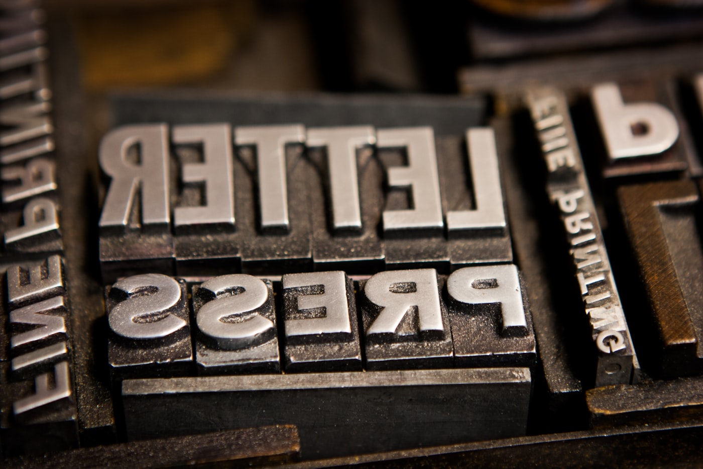
A butcher shop in Garfield Park started stamping their bags last spring. Their name and a small cow icon, pressed in dark ink on kraft paper. The impression wasn't centered every time. The ink bled at the edges.
I kept one of those bags on my kitchen counter for a week before I threw it out.
That bag looked imperfect. It also looked more like a real place than most brand materials I see in a month.
What happened to smooth design
From roughly 2020 through 2024, the move in small shop branding was smoothness. Clean sans-serifs, flat gradients, glossy laminate on menus and cards. Apps like Canva made it easy to build something slick in five minutes. The results often looked fine. They also often looked identical.
The design world started pushing back, and by early 2026 the shift was visible in the studios doing the most interesting work. Their logos had a little grain. Their Instagram graphics looked like they'd been printed on paper and photographed. Their menus had a slight tooth to them. Multiple 2026 design trend reports from Envato, Krumzi, the Branding Journal, and Design and Paper landed on the same descriptor: tactile.
What the grain trend is, specifically
Grain in this context means visual texture, not physical. Not the paper you're printing on or the ink you're using, but the appearance of texture baked into the digital file itself.
A grain overlay is a layer of subtle noise: tiny, randomized variation in color value that reads as the imperfection you'd see in a photograph, a photocopy, or a letterpress print. Applied lightly (10-20% opacity), it does something a flat vector graphic can't. It makes the design look like someone made a choice with their hands.
The timing connects to something real. AI tools in 2025 and 2026 got very good at generating smooth, polished visual assets. Grain is one of the things those tools don't naturally reach for. So grain became a quiet signal that a person was in the room.
A polished logo tells people you paid for design. A grain overlay tells them you care about it.
This doesn't suit every shop. A mechanic or a dental office generally wants clean, precise visuals (precision is part of what they are selling). But for cafes, food spots, breweries, boutiques, salons, tailors, bookstores, florists: anywhere warmth and craft are part of the draw, grain does real work.
Where I'm noticing it most
The clearest version shows up in Instagram graphics. Coffee shops and bakeries posting their weekly specials. The posts getting saved and shared right now have a particular feel: warm, slightly textured backgrounds that make the design look like a printed card rather than a Canva template. Two minutes to add in Canva. Real change in tone.
The second place is business cards and menus. A taco spot in Irvington reprinted their takeout menu on uncoated linen stock this spring. Same layout, different paper. The old version was glossy. The new one has a slight surface texture you can feel when you pick it up. Cost difference: about four cents per menu. The new one looks like it belongs in that restaurant. The old one looked like it was printed at FedEx in 2019.
The third place is logos. Not full rebrands. A subtle grain pass applied to the final file, so the finished asset has warmth at close range and reads clean from a distance.
How to add it to what you already have
In Canva: when building a graphic, open the elements panel and search "grain overlay" or "grain texture." Add one and set the transparency to around 15%. Drag it above your background layer but below your text. Your next Instagram post will look less like every other post from that same Canva layout.
For printing: when you order business cards or menus through Moo, Canva Print, or a local printer, ask for uncoated stock or matte finish instead of glossy or satin. Uncoated paper has natural surface variation. It costs the same at most printers and holds grain designs better because the texture in the file matches the texture of the surface.
For your logo files: this is a conversation with your designer, not a solo fix. If you're getting a logo refreshed or brand assets built out, ask for a version with a light grain layer in the finished files. Something subtle: human at close range, invisible at a distance. Any designer working in 2026 knows exactly what you mean.
The bag from Garfield Park worked because someone pressed a stamp by hand and didn't fuss over the bleed. That's the thing. Imperfection with intention reads as craft, and most people can feel the difference even when they can't say why.
Sources
- Top 3 Branding Design Trends to Watch in 2026: Texture, Typography & Earthy Colors -- Texture confirmed as one of the three dominant branding trends in 2026.
- 12 Graphic Design Trends 2026 -- Paper grain and tactile craft elements in 2026 design.
- Graphic Design Trends 2026: Why Imperfection Is Winning -- The shift toward strategic imperfection as a counter to AI-generated smoothness.
- Web design trends for 2026: kinetic type, broken grids and the return of visual personality -- The broader move toward texture and personality in digital design.
- Top Branding & Design Trends For 2026 -- Tactile trend confirmed across multiple branding publications.