Journal · Brand
What every iPhone has been teaching your customers about your shop
Apple's Liquid Glass redesign in September 2025 put depth, translucency, and layering on every iPhone. Eight months later, customers feel the difference when your shop doesn't have it.
The sign outside a tea shop in Greenwood stopped me last month. The shop's name is in brushed metal letters, each one mounted on a small standoff so it sits about a half inch away from the wall. When afternoon light hits them from the side, each letter casts a thin shadow behind it.
The shop next door uses a flat vinyl decal. Same commercial strip, same general quality of business. The dimensional letters make you look twice. The vinyl does not.
The tea shop owner did not hire a designer to figure that out. She called a sign shop, looked at two options, and chose the one with depth. That choice is doing more for her now than it would have done three years ago, and Apple is a big part of why.
What Liquid Glass actually is
Apple announced a completely new design language for all its software at WWDC in June 2025, launched it with iOS 26 in September 2025, and called it Liquid Glass.
It is the biggest redesign of the iPhone's interface since iOS 7 in 2013. For twelve years, the iPhone looked essentially the same: flat panels, solid color backgrounds, crisp hard borders. Liquid Glass changed the entire visual logic. The interface now looks like it is made of actual glass. Panels are translucent. You can see content through them, blurred and tinted. Navigation bars shimmer and shift depending on what's behind them. Elements cast soft shadows on each other. Everything has depth.
The reception was mixed. Some users love it. Others called it distracting or hard to read in direct sunlight. Apple added an accessibility toggle to revert the look. But adoption was real: iOS 26 rolled to hundreds of millions of iPhones in the fall of 2025, and by now, most iPhone owners have spent the better part of eight months looking at this interface every single day.
That is the number that matters.
What looking at the same design 80 times a day does to the eye
Your brain learns what "normal" looks like from repetition. When flat design took over in 2013, it took roughly two years for flat-looking websites to start feeling current and raised-button sites to start feeling old. Nobody told you that. Your eyes recalibrated on their own.
Liquid Glass is the same mechanism, running in the other direction. The average person picks up their phone about 80 times a day. Every time they do, they see translucent panels, layered depth, surfaces that sit in front of and behind each other. Their visual system is quietly absorbing: this is what current looks like.
When something feels slightly off about a shop, customers rarely say "this design lacks depth." They say "I don't know, it just felt a bit old." That feeling is real. And more of it is coming from the contrast with what they see all day on their phone.
This does not mean you need to renovate. It means one layer of depth, placed in the right spot, can shift how current your space registers.
What depth looks like when it's not on a screen
Depth in the physical world is texture, dimension, and surface contrast. Most of the ways to get it cost less than a month of a typical "marketing package."
Dimensional signage. Flat vinyl letters on a wall read as "I printed this myself." Routed letters, foam letters, or brushed metal letters on standoffs read as "we built this." The letters cast shadows. The eye notices. A basic set of mounted interior dimensional letters typically runs $200 to $500 through a local sign shop, depending on size and material.
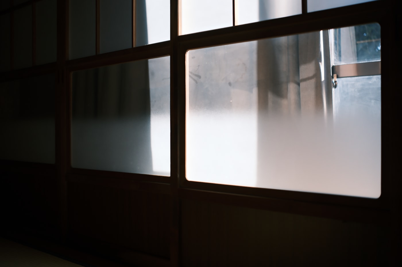
Frosted window film. A frosted cling cut to a logo shape or a simple panel, applied to your front door or the window beside your counter. It lets light through while creating a translucent surface layer. A sign shop can cut and apply a 12" x 24" panel for $100 to $175. It is a small thing that reads as intentional.
Spot UV business cards. A matte-coated card with a gloss spot on your logo or one key line. The rest of the card is flat. The logo catches light slightly when it moves. Cost: roughly $80 to $120 for 250 cards from a print shop. It is the kind of thing people notice in their hand without being able to say why.
Layered menus. A menu board with a dark backing material and printed cards pinned or slotted in front of it. Or a framed chalkboard with printed inserts. There is a background and a foreground and the eye can feel the separation. This is a hardware-store trip and an afternoon, not a design project.
Any one of these is a single decision. Total investment for one of them is well under $200 for most shops.
Does this affect your website?
A little, and worth knowing if you're planning anything.
Liquid Glass has made flat, single-surface website buttons look like they belong to 2016. Not wrong, but visually older in the way that gradient beveled buttons from 2009 look now. If you're planning a refresh or talking to a developer about updates, it's worth asking about cards with gentle drop shadows, layered navigation, and subtle overlapping elements. You're not asking for a rebuild. You're asking for one plane of depth.
If your site was built four years ago and you have no update planned, this is not urgent. File it for the next time you're touching the site.
The sign and what it signals
That tea shop in Greenwood is good. The tea is good. The owner knows her products. But the dimensional letters outside are also doing something: they signal that someone thought carefully about this space.
The flat vinyl next door signals the same information as the letters. Business name, hours, what's inside. But only the letters make the eye slow down.
Apple didn't create that effect by itself. But eight months of Liquid Glass on every iPhone, seen about 80 times a day, has made depth the thing customers notice when it's missing.
Sources
| # | Source | What it backed up |
|---|---|---|
| 1 | Apple introduces a delightful and elegant new software design | Liquid Glass announcement at WWDC, June 2025; Apple's own description of the design system. |
| 2 | iOS 26 — Wikipedia | Launch date (September 15, 2025), scope of the redesign, mixed consumer reception, accessibility opt-out. |
| 3 | Liquid Glass — Wikipedia | Technical description: translucency, refraction, depth, unified design across all Apple platforms. |
| 4 | Apple's iOS 26 with the new Liquid Glass design is now available to everyone — TechCrunch | Public release confirmation and early reception summary. |
| 5 | What You Should Know About Apple's Liquid Glass Design Language — Rocket Farm Studios | Analysis of Liquid Glass visual characteristics and design implications. |