Journal · Brand
What 18,000 people taught Google about boring design
People spot key elements four times faster in expressive design, Google found after 46 studies with 18,000 participants. That same principle holds for your shop's sign, your menu, and your door.
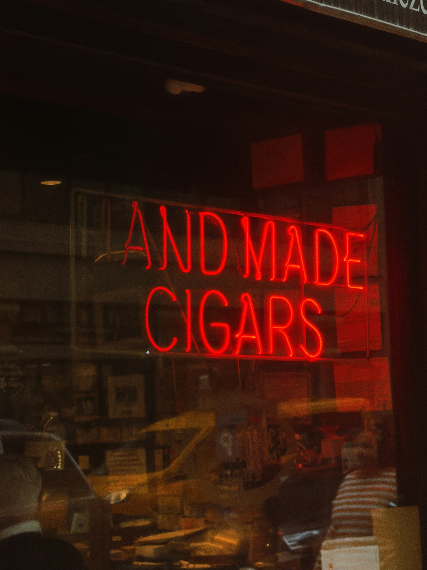
Two jewelry stores sit within a mile of each other in Zionsville. One has a muted sage-green awning and a hand-lettered window. The other has a white sign, a Helvetica logo, and a floor that could belong to any dentist's waiting room.
The first one had a line on a Saturday morning. The second one didn't.
Google spent three years and 18,000 research participants explaining the gap.
What the research found
In 2022, a researcher at Google was studying how people felt about Google's own apps. Her finding: they all looked the same. Flat, "clean" in a way that had started to mean nothing. That observation sparked a team-wide conversation that led to 46 separate studies and the largest overhaul of Google's design system in years.
They called the result Material 3 Expressive.
The numbers from those studies:
- 87% of people ages 18–24 preferred the expressive designs over the flat standard versions. The preference was positive across every age group.
- People spotted key interface elements up to four times faster in expressive designs, measured with eye-tracking in a lab.
- Expressive design made brands feel 34% more modern and 32% more relevant to the people looking at them.
Google's definition of expressive: intentional color, shapes with personality, contrast that tells the eye where to go, sizes that signal what matters. Loud isn't the requirement. Deliberate is.
Does your shop feel like anything?
That's the question the research is asking.
A white sign with a blue font makes a choice too. It says: we are here, we sell this. It doesn't say anything else. And "nothing else" is what disappears from memory on the walk back to the car.
The shops I remember all made one strong visual decision. A color. A sign. A counter material. One thing that meant something and stayed.
I can walk a block in Greenwood or SoBro and predict which shops I'll still picture next week. The ones that stick made a deliberate choice about something visible. The ones that blur together made safe ones.
The one thing worth changing
Google's research named five design levers: color, shape, size, contrast, and motion. For a shop that isn't redoing its entire brand tomorrow, that's still useful.
Pick one.
Find the thing in your current brand sitting on its default setting. The color of your front door. The weight of the font on your A-frame sign. The paper stock for business cards because it was the cheapest option in the printer's catalog. The placeholder photo on your homepage that could belong to any shop in any city.
Pick it. Make a real decision about it. Commit to it consistently across every place that thing appears.
The sage-green awning in Zionsville is not louder than the white sign next door. It is more decided. That's the whole gap.
Google needed 46 studies to prove it. You can start proving it next week.
Sources
| # | Source | What it backed up |
|---|---|---|
| 1 | Expressive Design: Google's UX Research | 46 studies, 18,000+ participants, 87% age-18–24 preference, 4x faster attention, 34% modernity and 32% relevance boosts |
| 2 | Material 3 Expressive: Building with M3 Expressive | The five design levers: color, shape, size, motion, containment |
| 3 | Google I/O 2026: What's new in Material Design | I/O 2026 updates: expressive layout system, new motion physics, 35 additional shape variants |
Sources accessed June 16, 2026.