Journal · Brand
The italic text on your website is probably fake
Most small-business websites fake their italics. The browser tilts the regular letters instead of loading a real italic font file, and visitors notice even when they cannot say why.
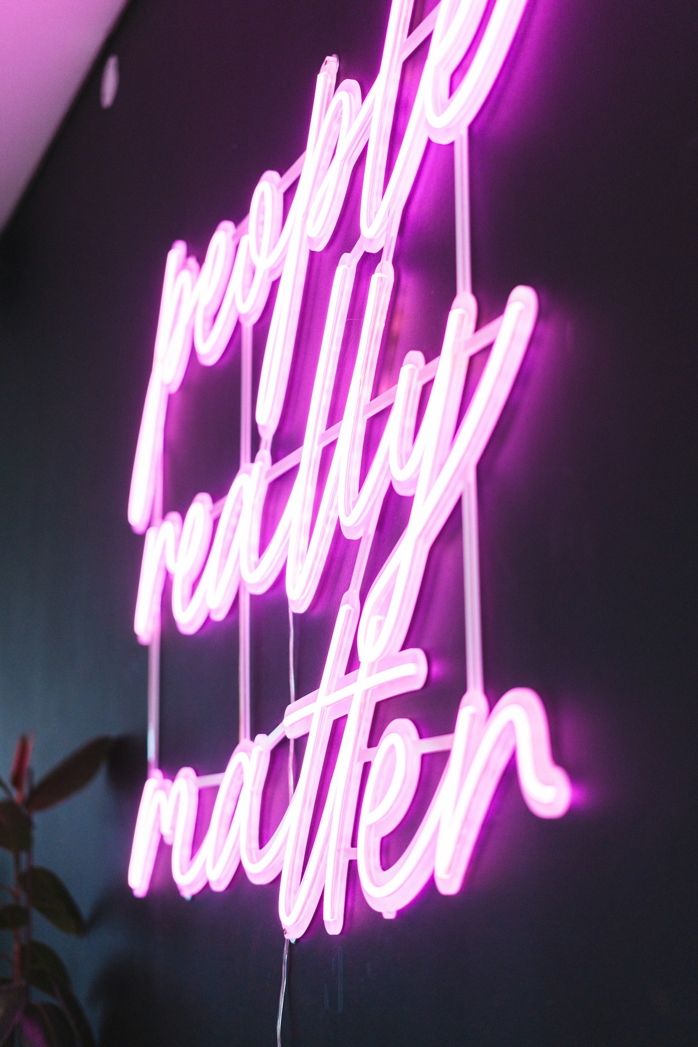
I was waiting outside a jeweler's shop near the Broad Ripple canal last week and pulled up their website while I waited. The tagline under the logo sat in italics: "Handcrafted since 1994." The letters looked shoved sideways with a ruler, nothing like handcrafted.
That is close to what happened.
A real italic versus a browser's fake one
Type an italic word into a document and you expect the letters to look drawn that way: different shapes, a little cursive influence, tighter joins. A real italic is its own typeface. A type designer draws it separately from the upright version, often with a single-story a, a looser rhythm, sometimes a different f with a small descender.
Your browser does not always have that second typeface to work with. When a website asks for italic text but only loads the regular weight of a font, the browser does not skip the request. It fakes the italic by leaning the upright letters, same shapes, tilted at a fixed angle. Type designers call this synthetic oblique. Everyone else calls it the ugly slanted text on a website that otherwise looks fine.
Google Fonts documents this directly in its build rules for type foundries: an italic has to ship as its own separate font file from the roman version. There is no shortcut where one file flexes into both. If a site does not deliberately load that second file, italic on that site is never real, no matter how modern the rest of the type system looks.
How do you tell if your italic text is fake?
Zoom into a word on your own site that is styled in italics. A testimonial quote, a tagline, a menu description, anywhere you used the italic button. Look at one letter at a time.
- If the letters are the same shapes as your regular text, just tilted at a uniform angle, that is synthetic. The browser leaned them for you.
- If the letters look different from the upright version, narrower joins, a different rhythm, that is a real italic doing its job.
I checked a dentist's office in Noblesville that runs patient quotes in italics on its homepage. Nice idea. Real testimonials, styled to feel personal and handwritten. The dentist wanted those quotes to feel warm and human. The synthetic italic worked against that on every quote on the page, same letterforms as the body text, just tipped over.
Why does this happen without anyone telling you?
Speed explains most of it. Templates and page builders load only the font weights they assume a site needs, usually regular and bold, to keep the page fast. Italic costs more to include, since the type spec treats it as a whole separate file rather than a setting. Builders cut it first.
When your CSS still calls for font-style: italic somewhere on the page, a blockquote, a testimonial block, a caption, the browser has to produce something. It fakes one rather than leaving the word upright. You never see this decision get made. You only see the result.
The mechanism sits right in the spec. The W3C allows font-style: oblique 14deg, an instruction to tilt letters by a set number of degrees, entirely separate from font-style: italic, which is supposed to load a real italic typeface. Most browsers fall back to that oblique behavior when a page asks for an italic it does not have. The code hides the swap. The visitor sees it in the words.
The five-minute check for your own site
Open your font picker, whether that is Squarespace, Wix, Webflow, or a developer's stylesheet. Most modern pickers now label which weights are included in a font family. If italic is not one of them, you have two honest options: switch to a font that includes a true italic, or stop italicizing text on that site and lean on color, size, or weight for emphasis instead.
If someone else built your site, ask them one direct question: did they load the italic weight, or is the browser faking it. It takes them thirty seconds to check, and it is a fair thing to ask, the same way you would ask a print shop whether they matched the color on your sign to the proof you approved.
A fake italic is a real tell. It says nobody who built this site looked closely.
Next time you are on hold with your own answering service, pull up your site and zoom into the first italic word you find. You will know in about four seconds which kind you are looking at.
Sources
| # | Source | What it backed up |
|---|---|---|
| 1 | Google Fonts guide: variable font specifics, ital/slnt axis rules | Confirms italic must ship as a separate font file from the roman weight, never as a variation axis within one file. |
| 2 | Google Fonts Knowledge: Slant axis (slnt) glossary | Defines the slant axis as a mechanical tilt of a font's letterforms for oblique styles, distinct from a drawn italic. |
| 3 | MDN: CSS variable fonts guide | Backs the technical equivalence between font-style: oblique and the slnt axis value used to fake a slant. |
| 4 | W3C CSS Fonts Module Level 4, font-style property | Source for the oblique <angle> syntax browsers use to synthesize slanted text. |
| 5 | Luminest: One font license that covers your website and sign | Related Luminest reporting on font licensing gaps for small business sites. |