Journal · Brand
Pantone made white the color of the year don't paint your shop to match
Pantone named a white, Cloud Dancer, its 2026 Color of the Year, the first white it has ever chosen. For a small shop, white is the color that makes you disappear next to the shop next door.
A bakery in Fishers repainted its whole storefront this spring. The old sign was a warm mustard yellow, a little sun-faded, and you could pick it out from the far end of the strip. Now the front is a soft white, the trim a pale grey, the name set in thin letters you have to be standing close to read. It looks calm and expensive. It also looks like the vape shop, the nail place, and the shuttered unit that used to be a phone store, all in a tidy row.
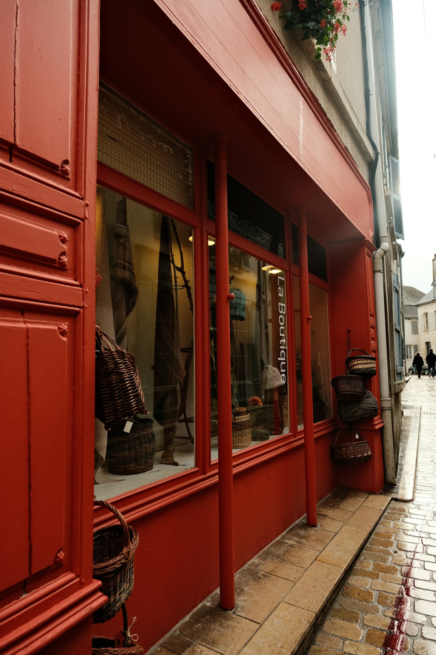
Two doors down, a taqueria painted its front a deep burnt orange, almost a persimmon. I can find that shop from my car before I can read a single word on the sign. Same strip, same rent, same people walking past. One storefront waves. One vanishes.
I keep thinking about those two shops because Pantone just told the whole design world to go the bakery's way. On December 4, 2025, the company named its 2026 Color of the Year, and for the first time since it started the tradition in 1999, the pick is a white. They call it Cloud Dancer, and they describe it as a quiet, calming color for a loud world. It is a pretty white. For a small shop trying to get noticed on a busy street, it is also close to the worst thing you could copy.
If you run a shop, the takeaway is short. Do not repaint your brand white to chase this. Pick one warm color you can own, and put it on everything. That is the real move for 2026, and it runs almost exactly opposite to what the color of the year suggests.
Should your shop follow the color of the year?
No, and it helps to know what the color of the year actually is. It is a forecast, aimed at paint companies, fashion houses, carmakers, and the people who design phone cases and throw pillows. Pantone sells color. Once a year it plants a flag on a shade, and the industries that buy color follow it. That is a real business, and it has almost nothing to do with your salon or your deli.
Chasing it carries two costs for a small shop. The first is timing. A color chosen to feel current in 2026 is the same color that will feel dated in 2028, and you are not repainting your sign every two years. The second is worse. When Pantone crowned this particular white, even design critics pushed back. Artnews called the choice "tone deaf." Whatever you make of that, a white storefront has one guaranteed effect on a crowded street: it blends in. A coffee roaster in Speedway and a barbershop in Franklin, both painted the same clean white, read as the same nothing from across the parking lot.
You do not want to look like this year. You want to look like yourself, for about the next ten years.
What color actually gets a small shop noticed?
A warm one, used with some nerve. The bigger color story of 2026 is not the white at all. It is the move away from cool greys and greige toward warm, human color: clay, cocoa, tobacco, cream, butter, with one saturated accent doing the shouting, a plum, a persimmon, a deep olive, a real red. Warm colors read friendly. They also read appetizing, which is not a small thing if you sell food. Grey reads like a waiting room.
Most shops get the next part backwards. You do not need a clever five-color palette. You need one color that is unmistakably yours, used everywhere, with conviction. The persimmon taqueria did not hire a brand studio. Somebody picked a color they loved and committed to it. A butcher in Brownsburg who wraps everything in the same deep green paper is doing more brand work with one color than most shops manage with a whole logo. A color of the year tells you what everyone will paint. That is the reason to paint something else.
How do you pick your one color?
Start with something real you already own. Not a mood board. The tile in your entry, the awning that came with the building, the tin your grandmother's recipe came in, the exact green of the bottles you sell. Your color is often already sitting in the room.
Then follow three rough rules:
- When you are torn, go warmer. Warm invites people in. Cool holds them at arm's length.
- Pick the one that makes about half your friends say it is "too much." The color people remember is usually the one that sits a little past comfortable. Safe colors are forgettable by design.
- Once you choose, use it with no apologies. The sign, the door, the cups, the bag, the wall behind the register, the top of your website. One color in every place a customer looks does more than five colors used once each.
White still earns its keep, and I am not telling you to fear it. Give your one color room to breathe: white walls, white space on the menu, plain paper around the thing that matters.
White makes a lovely background and a forgettable brand.
The bakery still makes the best morning bun on that side of Fishers. I hope the white is only paint, and not a quiet decision about who they are. The mustard is still their color if they want it back. It is sitting right there, under one afternoon of primer.
Sources
| # | Source | What it backed up |
|---|---|---|
| 1 | Pantone Color of the Year 2026 | The 2026 pick is Cloud Dancer (PANTONE 11-4201), described as a calm, quiet white. |
| 2 | NPR: Pantone chooses white 'Cloud Dancer' for 2026 | Announced December 4, 2025, the first white chosen since the program began in 1999. |
| 3 | Artnews: Pantone's 2026 color is tone deaf | Design critics pushed back on the white pick, calling it "tone deaf." |
| 4 | VistaPrint: Color Trends 2026 | The 2026 shift from cool greys toward warm neutrals and saturated accents. |
| 5 | Luminest: The smallest brand kit | Why one committed color beats a sprawling palette for a small shop. |