Journal · Brand
The clean, minimal look you paid for is aging your shop
For a decade, shops paid for the same clean, minimal look: thin gray text, a plain sans-serif, no color. In 2026 that look reads as dated, and warm type reads as trustworthy again.
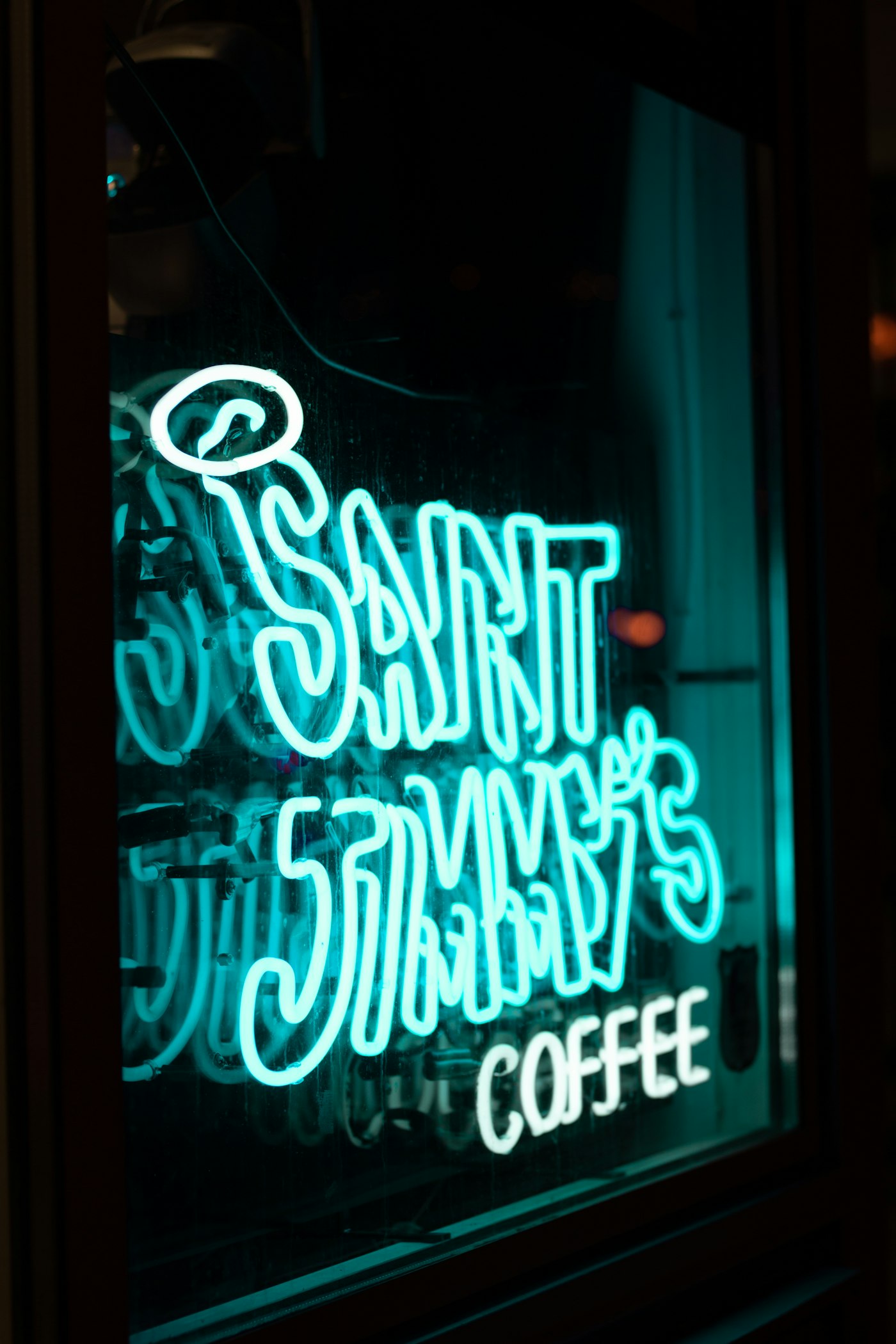
A new deli opened on a corner in Garfield Park a few weeks ago. The sign out front is hand-painted, a fat little serif in dusty gold, and it looks like it has been hanging there for thirty years. It went up in June.
Two doors down, an older shop paid for a "modern refresh" last winter. Thin gray letters, all lowercase, a sans-serif you have seen ten thousand times, floating in a lot of white space. It looks like a phone bill.
Two years ago this would have sounded backwards. The thirty-year-old-looking sign is the current one. The clean, gray, minimal one is the dated one.
For about a decade, every template and every agency pushed the same look at small shops. Thin type in a plain sans-serif, usually something close to Helvetica or Arial. Gray text on white, sharp corners, plenty of white space. It read as modern, so shops paid for it. In 2026 that same look reads as cheap, because it is exactly what a free tool hands you when you type nothing in. Warmth came back. So did serifs. And the cheapest way to catch up is to fix your type.
Why did the clean look start to look cheap?
Because everyone got it for free.
When the clean, minimal look is what your website builder ships by default, and what a free app or an AI generator hands anyone who types nothing in particular, it stops signaling taste. It just tells people you took the default.
Every 2026 font and design forecast I read this year lands in the same place. Designers are calling it neo-minimalism: keep the white space, but add a serif, an earthy color, a little texture. They are calling the wider mood personality over polish. After years of gray, AI-smooth sameness, the eye reads warmth as a human and gray-minimal as a machine.
You can watch the big platforms turn, too. Google spent 2026 rolling out a design language it named Material 3 Expressive, with rounder shapes, bolder color, and springier motion. The company that trained everyone's eye toward flat and minimal is walking it back.
A thin gray sans-serif used to say "we're modern." In 2026 it just says "we used the default."
What does warm type actually look like?
Cold is Arial, Helvetica, or the thin default your site builder shipped, set in gray at a weight so light it disappears in the sun. Warm is a font with a serif or some real body to it, dark enough to actually read, in a color that is not gray.
A few swaps I would make tomorrow:
- A bakery whose menu is set in thin gray Helvetica. Move the item names to a warm serif at full black. The croissant suddenly looks like it costs what it costs.
- A wine shop in Zionsville with an all-lowercase sans logo. Give the wordmark weight and a real color, oxblood or deep green instead of gray. It stops looking like an app and starts looking like a shop.
- A taqueria whose website headline is a 300-weight sans in light gray. Bump it to a heavier cut in near-black. Nothing else. The whole page reads as more sure of itself.
None of that is a rebrand. It is a better font and a darker color.
The one change worth making this month
Pick your single most-seen piece of type. Usually it is your shop name on the sign, or the headline on your homepage, or the item names on your menu. Just one.
Then do two things to it. Give it weight, a bolder cut of whatever font you already have, or a serif if you can find one you like. And take it off gray, into near-black or a real brand color. That is the whole move. It costs nothing on a website and the price of one sign in the window.
If you want a starting point, Google Fonts is free and full of warm, readable serifs like Fraunces, Bitter, and Source Serif. Pair one of those for your headlines with a plain, readable font for the small print, and you have most of the 2026 look for the price of an afternoon.
The deli in Garfield Park did not hire a design studio. Somebody's cousin painted the sign, and they picked a font that looked like their grandmother's. That instinct, warm and a little old over cold and new, is the right one for the next couple of years. Trust it.
Sources
| # | Source | What it backed up |
|---|---|---|
| 1 | Google — Material 3 Expressive launch | Google's 2026 design language moved to rounder shapes, bolder color, and springier motion. |
| 2 | Fontfabric — 2026 design & typography trends | The 2026 shift away from polished minimalism toward warmth, imperfection, and typographic personality. |
| 3 | Vistaprint — 2026 font trends | Warmer, rounded, serif-leaning type and the "personality over minimalism" advice for brands. |
| 4 | Creative Bloq — top typography trends for 2026 | The return of expressive, joyful, serif-forward type over neutral sans-serifs. |
| 5 | Google Fonts | Free warm serifs (Fraunces, Bitter, Source Serif) any shop can use at no cost. |