Journal · Brand
The texture of your menu is doing sales work
The material you print your menu on is a price signal. A laminated insert tells customers to expect $12 entrees even when you're charging $28.
A brewery in Fishers handed me their menu last spring. Single sheet, uncoated cream card stock, folded once. The specials were written by hand in the margin. I noticed the paper before I read anything on it, and before I looked at a price I already knew this wasn't a seven-dollar beer situation.
Two weeks later I had lunch in Zionsville. The menu came in a plastic sleeve, wiped so many times the corner had turned yellow. Before I looked at a price, I was calibrated for twelve dollars. The sandwich was twenty-two. I paid it, but something felt off.
The sandwich was good. The mismatch was in the material.
What happens before your customer reads a word?
The brain processes tactile information faster than it processes language. Weight, texture, and surface finish register before words do. By the time someone reads "$26" on your menu, their internal price expectation was already set by the thing in their hands.
Heavy, uncoated card stock signals one price range. A laminated insert in a sticky plastic sleeve signals another. Kraft paper with a clean typeface signals something considered, even before the first item.
This is sensory priming. The menu is doing sales work the moment someone touches it.
What does a laminated menu actually signal?
Laminate made sense when it arrived. One wipe, survives the lunch rush, lasts years. All of that is true. And the signal it sends is also true: "this menu has been in rotation a long time and needed to survive." That signal lands before any of the food sounds good.
The worst case is the mismatch: laminated menu, twenty-eight dollar entrees. The customer's brain was calibrated for fourteen, sees twenty-eight, and doesn't feel like they found something. They feel overcharged. That exact gap shows up in reviews that say "not worth it" about food people actually liked.
If your prices are higher than your materials suggest, you're working against your own menu.
Why 2026 is a good moment for indie shops
There's a design trend running through 2026 that the industry calls Tactile Craft. Adobe, Envato, and The Branding Journal have all named it: printed materials that look handmade, textured, weighted. Design studios are charging ten thousand dollars to make corporate brands feel like the corner cafe.
What that means for your shop: if you've been printing on uncoated card stock, stamping your bags with a rubber stamp, or writing specials by hand, you've been doing the trend before it had a name. The aesthetic that read as "we couldn't afford a designer" five years ago reads now as "we made a deliberate choice."
The design world is spending serious money to look like what indie shops do by default. That window won't stay open forever, but right now it's open.
The reverse is also true. If you switched to laminate or polished templates to seem more professional, this is a reasonable moment to reconsider.
Which materials are worth changing first?
Menu stock. Uncoated card stock, linen paper, or kraft paper. A clean two-color print on a decent uncoated sheet reads as considered. A laminated Kinkos copy reads as 2004. The cost difference per print run is minimal. The signal difference is not.
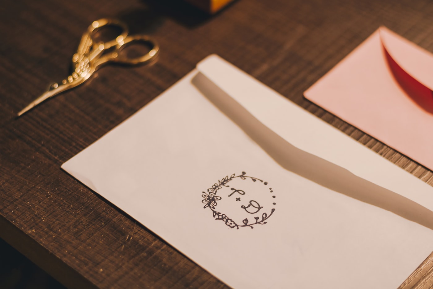
Packaging. If you're bagging things (to-go orders, a bakery box, a boutique purchase), a kraft bag with a rubber stamp of your name costs roughly what a plain plastic bag does. The stamp doesn't have to be perfect. Off-center, a little ink-heavy in one corner: that's the point.
Business cards. Uncoated or matte finish, one or two colors. A simple matte card beats a glossy one every time right now. If the budget allows, letterpress on a thick stock is having its moment. We wrote about rounded corners last month. Still true.
One thing to leave alone: fonts that look like handwriting. A digital typeface that mimics handwriting, a logo with a fake-worn edge, a rubber-stamp effect in Canva. Customers feel the difference before they can explain it. The value of tactile design is that it's real. Faking it gets you the look and loses you the trust.
The trend is on your side right now. For a shop that's been printing on the same uncoated cream card stock for six years out of habit, that habit and this moment happen to line up. That doesn't happen often. It's worth knowing about.
Sources
| # | Source | What it backed up |
|---|---|---|
| 1 | Design Trends 2026, Adobe Express | Tactile Craft named as a 2026 design trend; handmade and imperfect aesthetics in print. |
| 2 | Top Branding and Design Trends for 2026, The Branding Journal | Confirms the handmade, imperfect, human direction in 2026 brand design. |
| 3 | Logo and Branding Trends for 2026, Envato Elements | Tactile Craft defined: references to embroidery, fabric, cut paper as a counterpoint to flat AI imagery. |
| 4 | Luminest: The corner of your business card | Related post on printed materials and how small physical details signal brand quality. |
.