Journal · Brand
Jif kept the same logo for 30 years and only fixed one thing
Jif's first brand refresh in more than three decades kept its tri-color logo and deleted a single drop shadow, the same fix most small business logos still need.
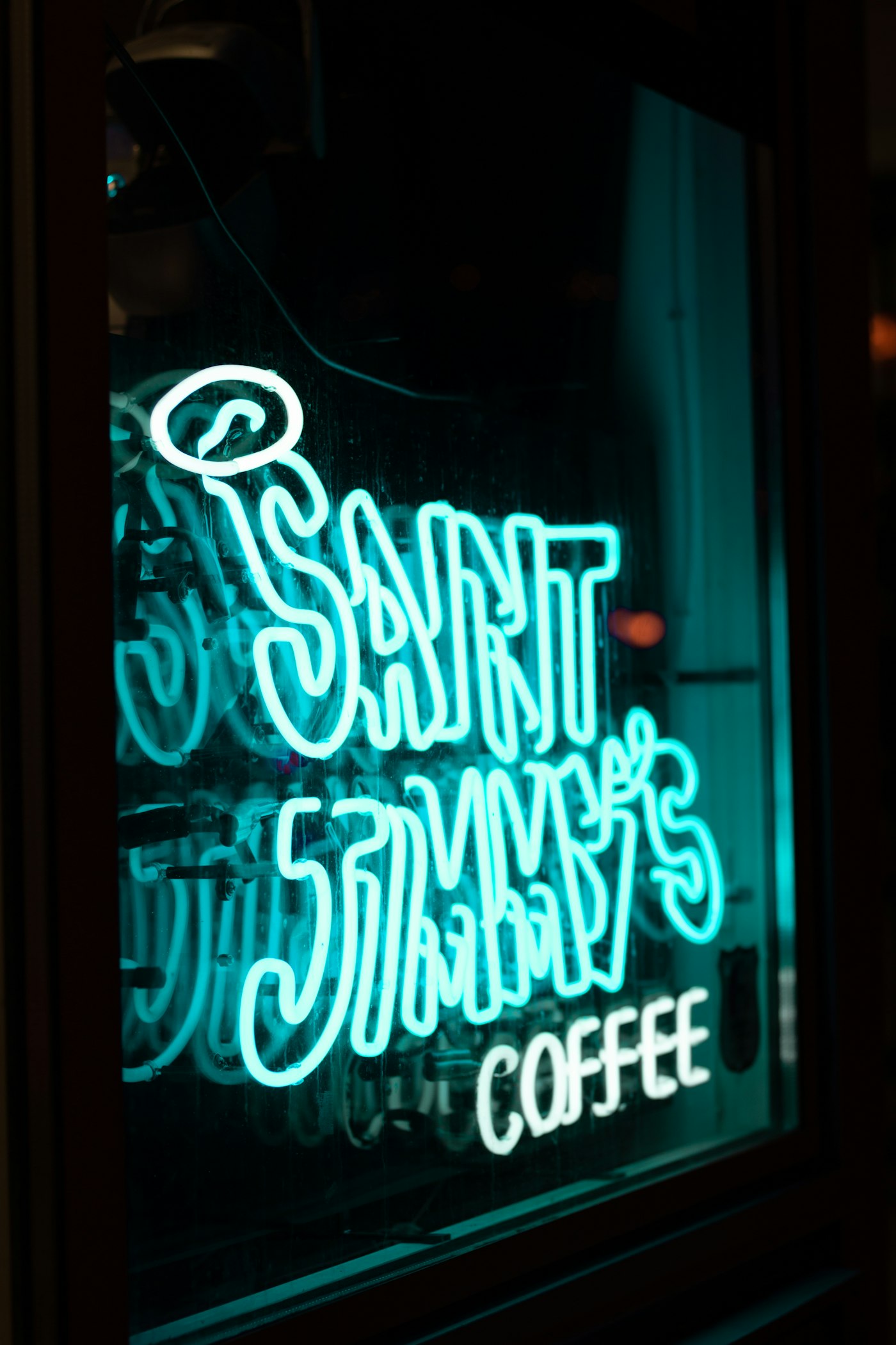
The tailor shop on Washington Street in Irvington has a window decal that's probably older than some of its customers. The shop name sits in a heavy black drop shadow, offset about a quarter inch, the kind that came standard on every WordArt banner in 2008. The afternoon sun hits it sideways most days, and the shadow stops reading as a shadow. It reads as a smudge on the glass.
Jif has the same problem, at a much bigger scale, and this month it fixed it.
What Jif actually changed
On August 10, 2026, The J.M. Smucker Co. announced the first major style update to the Jif brand in more than 30 years. Marketing Director Shelly Kowal called it an update built with "real intention," meant to honor what people already recognize while giving the shelf presence some new energy.
The redesign revived Jif's signature tri-color banner. It kept the script, the colors, the layout everyone already knows from thirty years of grocery runs. The one thing it removed was a drop shadow sitting behind the letters, the kind of dated depth effect that made the wordmark look heavier than it needed to be. Smucker's called the result "cleaner" and "bolder," and said it would stand out better "both on shelves and online." New packaging starts shipping in October and rolls out through stores in waves into early winter. Nobody at Smucker's is calling this a rebrand. It's a refresh, and the whole refresh is one deletion.
Why a drop shadow needs to go
Drop shadows, bevels, and glossy gradients were the default look of logo and interface design for roughly a decade, from the mid-2000s through 2013, when Apple's iOS 7 pushed the entire industry toward flatter, simpler visuals. That shift happened in the design world over a decade ago. It took a lot longer to reach small business signage, menus, and window decals, where a lot of logo files just never got touched again after the original designer handed them over.
The reason it's worth fixing isn't nostalgia. It's legibility. A drop shadow adds contrast and detail that only works at a certain size. Shrink that same logo down to a 32-pixel browser tab icon, an Instagram profile circle, or a screen-printed patch on a polo shirt, and the shadow doesn't shrink gracefully. It muddies the letterforms instead of framing them. Favicon designers deal with this constantly: at 16 to 32 pixels, a mark needs one bold shape, strong contrast, and almost no extra detail, because anything low-contrast or fussy just disappears.
A used car lot in Greenwood I looked at recently has a logo with a chrome bevel effect on its Facebook cover photo, the kind of racing-decal shine that was everywhere around 2009. On the full-size banner outside, it reads fine. Shrunk down to a phone screen, it turns into a gray smear where the dealership's name should be.
The audit any shop can run this week
You don't need a design degree to check whether your logo has the same problem Jif just fixed. Pull it up in three places:
- Your favicon, the tiny icon in the browser tab. If you can't tell what it is, that's the shadow or the detail talking.
- Your Instagram or Google Business profile photo, cropped to a circle. Same test.
- A black-and-white photo of your sign or menu from across the room.
A drop shadow was never a design choice. It was a default nobody turned off.
If any of those come back blurry, muddy, or hard to read, you're looking at the same fix Jif just made: strip the shadow, rebuild the mark flat, keep everything else exactly as it is. That shadow has been quietly working against you since whoever built your first logo file left the default settings on.
You don't need a rebrand, you need an edit
A company the size of Smucker's still treated this as a slow, deliberate rollout, new packaging shipping in October and phasing in through winter, not an overnight swap. A small shop can move faster on the parts that cost nothing to change today: swap the cleaned-up file on your website and social profiles first, and let the printed stuff (menus, shirts, signage) cycle out on its own schedule as you reorder anyway.
The fix itself is usually cheap. Hand a designer your existing logo file and ask them to strip the shadow, the bevel, the gradient, and rebuild it flat while keeping your colors and your wordmark exactly as they are. For most shops that's an afternoon of work, not a four-figure rebrand.
The tailor on Washington Street probably doesn't think about that window decal much. Most owners don't, until someone points at the smudge. If the shadow looks heavier than the letters, you don't need a rebrand. You need an afternoon and someone who can open the file.
Sources
| Source | What it backed up
---|---|--- 1 | Jif® Unveils First Major Brand Refresh in More than 30 Years, The J.M. Smucker Co. (PR Newswire, Aug. 10, 2026) | What Jif changed, the "cleaner, bolder" language, the Shelly Kowal quote, and the October 2026 packaging rollout timeline. 2 | Skeuomorphism in UX: Definition, examples, and relevance today, LogRocket Blog | The history of drop shadows, gradients, and bevels as a design default, and the 2013 shift toward flat design. 3 | The Favicon: A Tiny but Mighty Variation of Logo Design, Kreafolk | Why logos need to be simplified for small sizes like favicons, and why low-contrast detail disappears at 16 to 32 pixels. 4 | When a small business is ready to rebrand, Luminest | Related Luminest reporting on the difference between a full rebrand and a smaller fix.