Journal · Brand
What your homepage photo is telling people
The first photo on your website forms an impression before anyone reads a word. Most small business sites open with a stock image or a blurry phone shot. Both are telling people the wrong thing.
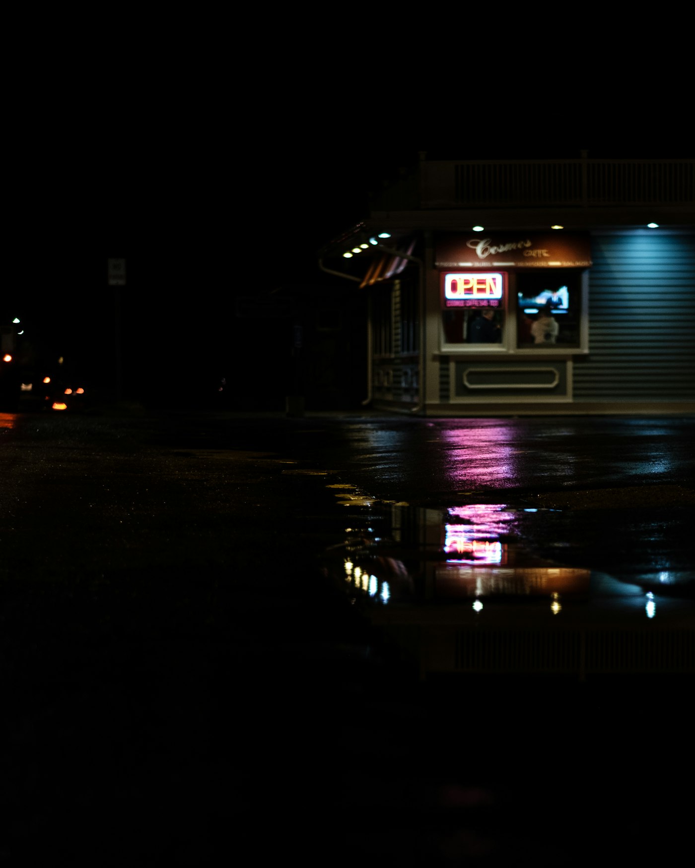
A woman with a tailoring shop in Irvington asked us to look at her website last spring. Before I even opened a browser, I looked at her Instagram. It was lovely. Her hands smoothing fabric over a dress form, her window display on a foggy morning, a close shot of a lining being hand-stitched. You could feel the care in the place.
Then I opened the website.
The photo at the top was a stock image of a sewing machine. Bright white background. Blue-tinted. It could have been selling accessories on Amazon.
The gap between what her shop looked like and what her website said it looked like was the whole problem.
The gap between a shop that looks established and one that looks amateur often comes down to one photo.
What does a hero photo communicate?
A few things, and most of them happen before the viewer can name them.
It tells someone whether your shop pays attention to details. A photo that shows your actual space, lit well, with something real happening in it reads differently than a template image. People can't articulate why, but they feel the difference.
It tells them whether the place is alive. An interior shot taken at noon, no one around, chairs empty, reads as flat. A photo with a person doing something in the background, even out of focus, reads as active.
It tells them whether you look like your competition. If you sell specialty coffee and your hero photo is indistinguishable from a chain header, you've spent your first impression saying nothing about yourself.
UX research on first impressions puts the threshold at around fifty milliseconds. Faster than a blink. The photo at the top of your site forms that impression before anyone reads the headline.
What makes a bad hero photo?
The two most common problems look nothing alike but come from the same place: the photo is filling a space instead of doing a job.
Stock images. The owner picks something pretty from a library because it looks professional. A gleaming commercial kitchen. A perfectly lit jewelry counter. A pair of hands holding a coffee cup in filtered light. Nothing in the image is theirs. Customers have seen it on fifty other sites. They register the absence of any specific place, and they move on.
Outdated phone shots. The owner took a photo when they opened two or three years ago. The paint is different now. The display is different. The photo is underexposed, shot at a weird angle, from too high. It sits at the top of the homepage and tells people what the shop used to look like.
What a good hero photo does
A hero photo that works is specific. You should be able to name what's in it in three or four words. "Barber doing a fade." "Baker pulling trays at dawn." "Bookstore window at dusk." A reader sees it and knows what kind of shop it is, and what the feel of the place is, before they've read a single word.
A few things that tend to show up in photos that work:
The shop at its best moment of day. For a bakery, that's early morning when the trays are fresh. For a barbershop, it's Saturday afternoon, chairs occupied. For a gym, it's a class mid-session, not an empty floor. Shoot at that moment, not on a quiet Tuesday at two in the afternoon.
A person doing the actual work, not posed for it. A tailor pressing a seam. A mechanic looking at something under a hood. Movement implies the place is in use.
The shop's one best-looking detail, close up. A hand placing an espresso cup. A bolt of fabric spread on a cutting table. A row of handmade candles on a wooden shelf. The part of the shop that made you open it in the first place.
How do you shoot one today, without a photographer?
You don't need to hire anyone. You need good light and thirty minutes.
Shoot in the morning before you open, or in the last hour of daylight, when the light comes in at an angle instead of straight down. Overhead fluorescents make everything look flat. Morning light through a window does not.
Shoot horizontal. A horizontal photo fills a hero section. A vertical one doesn't.
Shoot from counter height, not from standing height. Eye level with the subject looks natural. Looking down at it doesn't.
Put something in the frame that implies movement. Steam. A hand. A tool mid-use. A still image that implies motion looks alive in a way a purely static one doesn't.
Take twenty shots. Of those, two will be worth using.
The Irvington tailor's window display was worth a full-page photo. She never thought to take it.
Sources
- How People Read on the Web (Nielsen Norman Group): First impressions form faster than conscious reading; the photo is the first signal processed.
- Hero Image Best Practices (HubSpot): Stock images feel generic even when readers can't name why; real photos build trust.
- Website Hero Image Guide (Shopify): Specificity and human presence in hero images improve conversion rates.
- Anatomy of a High-Converting Hero Image (ConvertCart): 50ms impression timing; concrete imagery outperforms abstract backgrounds.