Journal · Brand
What a barbershop font tells me about the barber
The typeface on your sign is already telling customers what kind of shop you run, before they read a single word. Ten minutes is enough to audit yours.
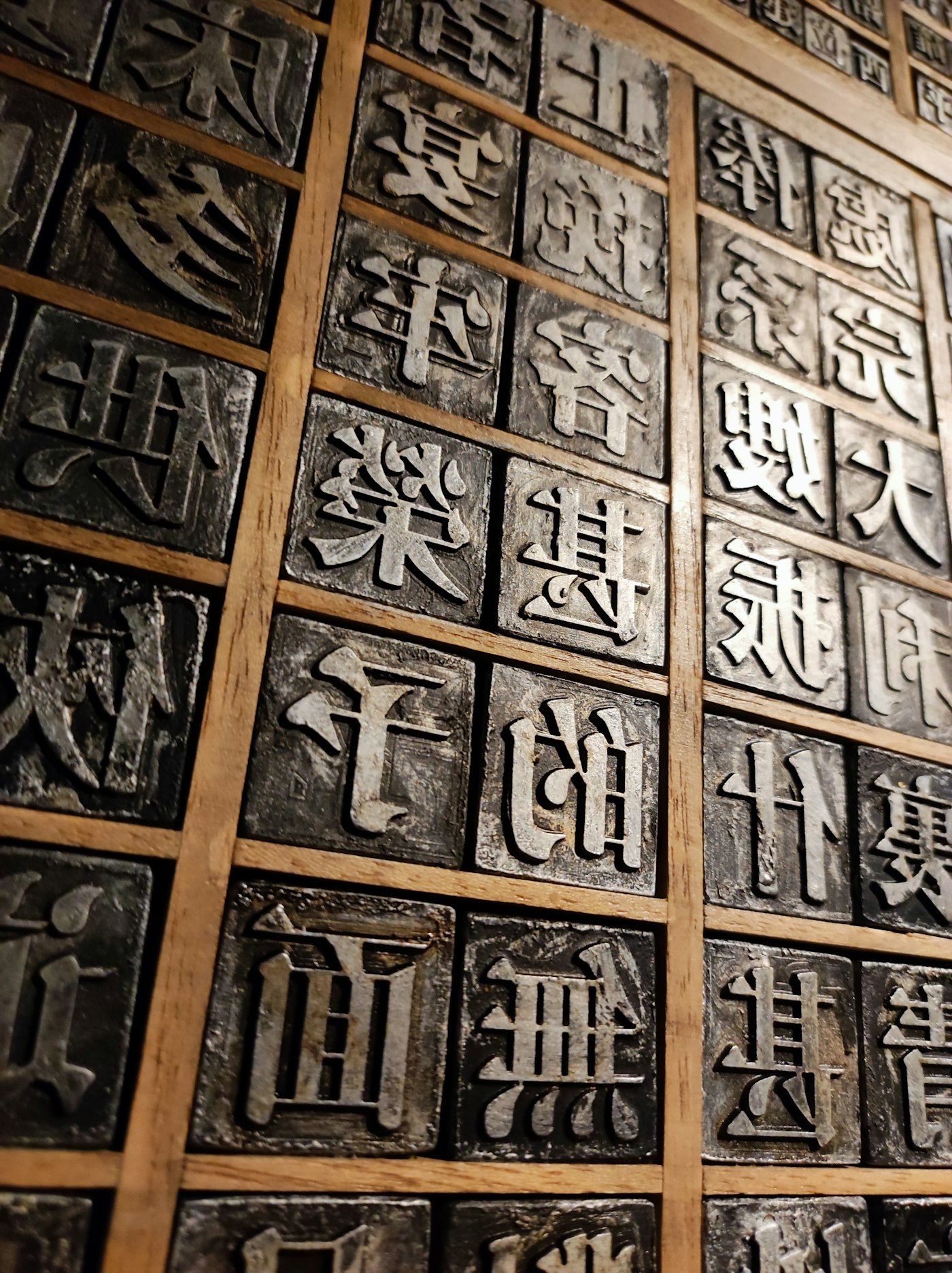
There's a barbershop in Speedway, off Main Street, that I drove past last month. The sign outside is bold black lettering, tight and tall, condensed enough that the letters look like they're standing at attention.
I almost pulled over.
I didn't know the barber. I didn't know the price. The font told me the cuts would be clean.
Fonts are a language every customer reads and nobody teaches
Most shop owners think about their font exactly once: when they made the first business card. They picked something that looked right or came with the website template, and that was the last time they thought about it.
But customers read it every day.
Fonts carry personality signals. The signal runs on pattern-recognition that most people can't explain. It sits underneath the actual words, shaping how they feel before they're processed. Customers use it to decide, in seconds, whether a shop is the kind of place they'd trust with their money.
The three broad personalities:
Bold, condensed sans-serif. This type says the shop has been doing one thing for a long time and doesn't waste your time. A mechanic in Greenwood. A gym in Westfield. A tattoo artist in Garfield Park. When this personality fits a shop, it lands with a certainty that's hard to fake. When it doesn't, say a florist who picked it because it was their website builder's "bold" preset, it reads wrong in a way the florist can't quite identify but customers register.
Classic serif. A serif with age and weight says trust and permanence. A jeweler on Mass Ave. A long-running Italian restaurant. A bookstore in Zionsville that's been on the corner for thirty years. Customers look at a well-chosen serif and feel, before deciding to feel it, that the business has been around, knows what it's doing, and will still be there next year. For shops where longevity and care are the product, a serif does work that no tagline can.
Script and brush. Handwritten type, warm and personal on purpose. The bakery that bakes their own bread, the florist who arranges by hand, the coffee roaster on Mass Ave who sources from a single farm.
The font on a bakery's sign tells me whether their croissants are from a commissary or from someone who got up at 4 a.m. to laminate dough.
Script fonts are powerful and easy to get wrong. Too thin and they disappear on a sign viewed from a car. Too ornate and they're unreadable in an Instagram caption. The best ones feel like the shop owner's handwriting with enough discipline to be legible.
Why your font might be reading as dated right now
Bold is back in 2026 in a way it hasn't been since the 1970s. Thick serifs, high-contrast display fonts, retro lettering with visible texture. These show up on the shop accounts that customers save and share.
This is partly a reaction. The mid-2010s were dominated by thin sans-serifs and lowercase minimalism, a look that aged quickly and now reads as indistinct. A shop whose visual identity was set during that era might not be reading as "clean and modern" anymore. It might be reading as "it's been a while."
A full rebrand isn't necessary. But if your font was trendy in 2014 and you haven't looked at it since, that's worth a few minutes.
Does your font match your shop?
Pull up your logo, your website, and your last three social media posts. Look at the typeface across all three.
Ask yourself: does the personality of this font match what my shop is?
A pediatric dentist using sharp, cold industrial type is sending a mixed message to parents choosing a provider for a six-year-old. A wood-fired pizza place using a clean tech-startup font is selling a product their type doesn't support.
Two more things to check:
Is the font consistent across every place your name appears? Inconsistency is what makes a brand feel unfinished more than any single wrong choice. A different font on your Google Business profile than on your sign, a different weight on your website than on your business card. Customers don't notice this directly, but they register it.
Can you read the font at arm's length on a phone screen? Most script fonts that shop owners love fail this one. Hold your phone at normal reading distance, pull up your logo, and look at it as if you've never seen it before.
Start with the digital version
If your type is off, the digital version is the place to start.
Social media graphics are built in Canva or similar tools. Pick one heading font and one accent font, commit to the pairing, and use them on everything you post for 30 days. This alone changes what new customers see before they ever step inside your shop.
Your website font is usually a developer's afternoon, or a 10-minute settings change on Squarespace, Shopify, or most site platforms.
Physical signage and print materials take longer and cost more. But you can get the digital type right today.
Sources
| # | Source | What it backed up |
|---|---|---|
| 1 | 2026 Font Trends for Branding and Marketing (Mango Marketing) | Bold and retro typefaces trending in 2026; thin digital sans-serifs reading as dated. |
| 2 | Typography Trends 2026: Fonts Designers Are Actually Using (IKA Agency) | Shift toward high-contrast display fonts and thick serifs across branding and social. |
| 3 | Instagram Trending Font 2026 (Accio) | Bold, retro, and brush font styles trending on Instagram shop accounts in 2026. |
| 4 | Top Font Trends in 2026 (Kittl Blog) | Survey of font direction across branding, Instagram, and web design. |
The font your shop picked in 2015 is still out there on your sign, your site, and your profiles, talking to everyone who looks. Worth knowing what it's saying.