Journal · Field notes
What big brands are paying $15,000 to fake
The handmade, imperfect, stamp-and-seal brand aesthetic is the most sought-after look in design right now, and many local shops already have it without knowing it.
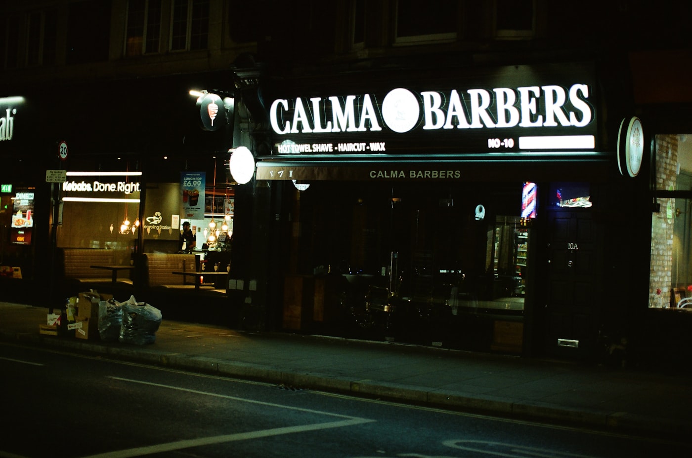
I stopped in at a barbershop in Noblesville a few weeks ago to drop something off for a client. The owner met me at the door. While he grabbed it from the back, I stood at the counter looking at the menu: prices written in chalk on a painted board, slightly uneven lines, each item spaced by eye. The business cards in a little ceramic dish had a circular stamp logo on thick kraft paper and a serif that looked pressed, not printed.
I took one of the cards.
Not because I needed a haircut. Because I recognized that aesthetic. And I knew exactly what it costs to commission from a studio right now.
What is actually happening in brand design in 2026
The biggest trend in logo and brand identity work this year is handmade, imperfect, analog. Stamp and seal logos. Hand-drawn type. Visible texture. Things that look like a human made them, maybe more than once, maybe with slightly different results each time.
This is not a small trend. Major design studios are pitching "organic imperfection" and "artisanal craft" as premium features. Envato, one of the largest design asset marketplaces in the world, named stamp and seal logo styles a breakout aesthetic of 2026 specifically because they signal authenticity in a market flooded with AI-generated, pixel-perfect everything.
The logic is simple. When anything can be generated to look flawless, flawless starts to look cheap. The human fingerprint becomes the luxury signal.
Adobe's 2026 design trend research puts it plainly: consumers are "actively craving the real, the raw, the handmade." The analog aesthetic shows up in hand-rendered fonts, earthy textures, low-contrast forms. It's in the letterpress revival, the stamp logo explosion, the kraft paper comeback.
Design studios that charge five figures for a brand identity package are now building their pitch decks around the things that look like they couldn't have been generated.
Why local shops already have what designers are charging to recreate
Many independent shops don't need a rebrand. They need to stop apologizing for the one they have.
A hand-lettered price board is, right now, a premium design choice. A stamp logo on a card is fashionable. A chalkboard menu with someone's actual handwriting communicates something that a slick Canva template never will, and what it communicates is: real people work here.
The imperfection is the point. The fact that it looks pressed rather than printed is what makes someone pick up the card.
I've watched shop owners flinch at their own materials. "I know the logo's a little rough." "A friend did it." "We need to redo that at some point." And I keep thinking: do you, though? Or is that roughness the thing people actually love about you?
How to tell if yours is worth keeping
Not every imperfect logo deserves to stay. There's a difference between something that looks handmade with intention and something that just looks unfinished. Here's how I'd sort it.
Worth keeping: hand-lettered or stamp-style type with real character, even if rough. A mark that's been on your aprons or your window long enough that people recognize it without reading the name. Anything that would look at home on a craft beer label or a local market stall. A card stock with actual texture.
Time to update: a logo that was clearly done in WordArt circa 2004 (there's imperfect, and there's this). A color palette chosen because it was the software default. Type so compressed or stretched it reads as an afterthought. Anything that looks like a clip-art badge with your name pasted in.
The test I use: does this look like someone made a decision, even if not a professional? If yes, it's probably in the current aesthetic. If it looks like nobody made a decision at all, that's a different thing.
What this means for your Instagram right now
Instagram shifted hard this year toward saves and DM shares as its top distribution signals. A single DM share now carries roughly 15 times the algorithmic weight of a like, according to social analytics teams tracking the 2026 changes. Posts that are worth keeping or passing along are what the platform rewards.
A photo of your hand-stamped price board, lit well, with a one-sentence caption about why it looks the way it does? That's a save. That's a share. That's the algorithm doing free work for you.
The polished, stock-photo-looking post is the one getting scrolled past.
You don't need a photo shoot. You need to stop hiding the parts of your shop that look the most like you.
One thing to look for this week
Find the most handmade thing in your shop: the chalkboard, the stamp card, the hand-painted sign, the printed menu with the little ink variations from the roller. Take one honest photo of it. Post it with one sentence about what went into it.
The barbershop in Noblesville has no idea their business card is a design trend. That's probably part of why it works.
Sources
| # | Source | What it backed up |
|---|---|---|
| 1 | Logo and Branding Trends for 2026 (Envato) | Stamp and seal logos named a breakout trend; handmade imperfection as an authenticity signal in 2026. |
| 2 | Design Trends 2026 (Adobe Express) | "Organic and analog" aesthetics in hand-rendered fonts and earthy textures; consumers craving raw and handmade. |
| 3 | 10 Branding Trends for 2026 (Logomaker) | Hand-drawn and imperfect logos gaining value as AI-generated imagery floods the market. |
| 4 | Instagram Algorithm Change 2026 (GOSO) | Four key 2026 distribution signals: DM shares, saves, watch time, profile clicks; likes carrying near-zero weight. |
All sources verified May 2026.