Journal · Brand
Affont Pocket: make your own font for a shelf card
Affont Pocket lets iPhone owners draw a reusable font for $9.99; test a short shop heading in your design app and at print size before making more.
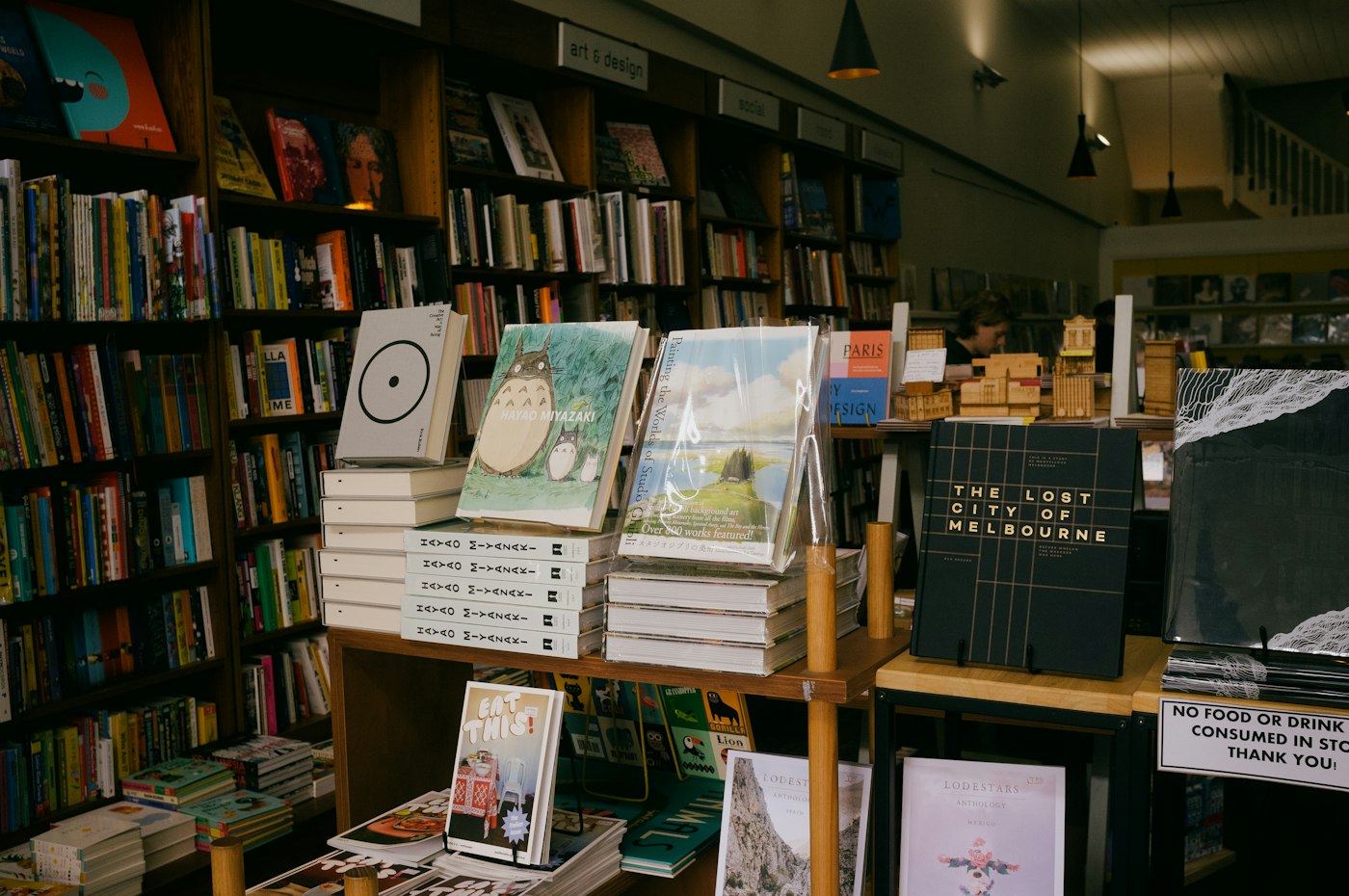
I like a bookstore shelf card with one lopsided word on it. For an independent bookseller in Franklin, I'd keep that loose lettering in “staff picks” and use a plain font for the recommendation underneath.
You can now try drawing that lettering as a reusable font on your iPhone. Affont announced Affont Pocket on November 7, 2026. My suggestion: make one short heading, print one shelf card, and check it in the shop before drawing an entire alphabet.
I haven't tested the app. I have read the maker's instructions and its App Store listing, and the small, repeatable job interests me more than the prospect of designing a whole typeface over lunch.
What does Affont Pocket do?
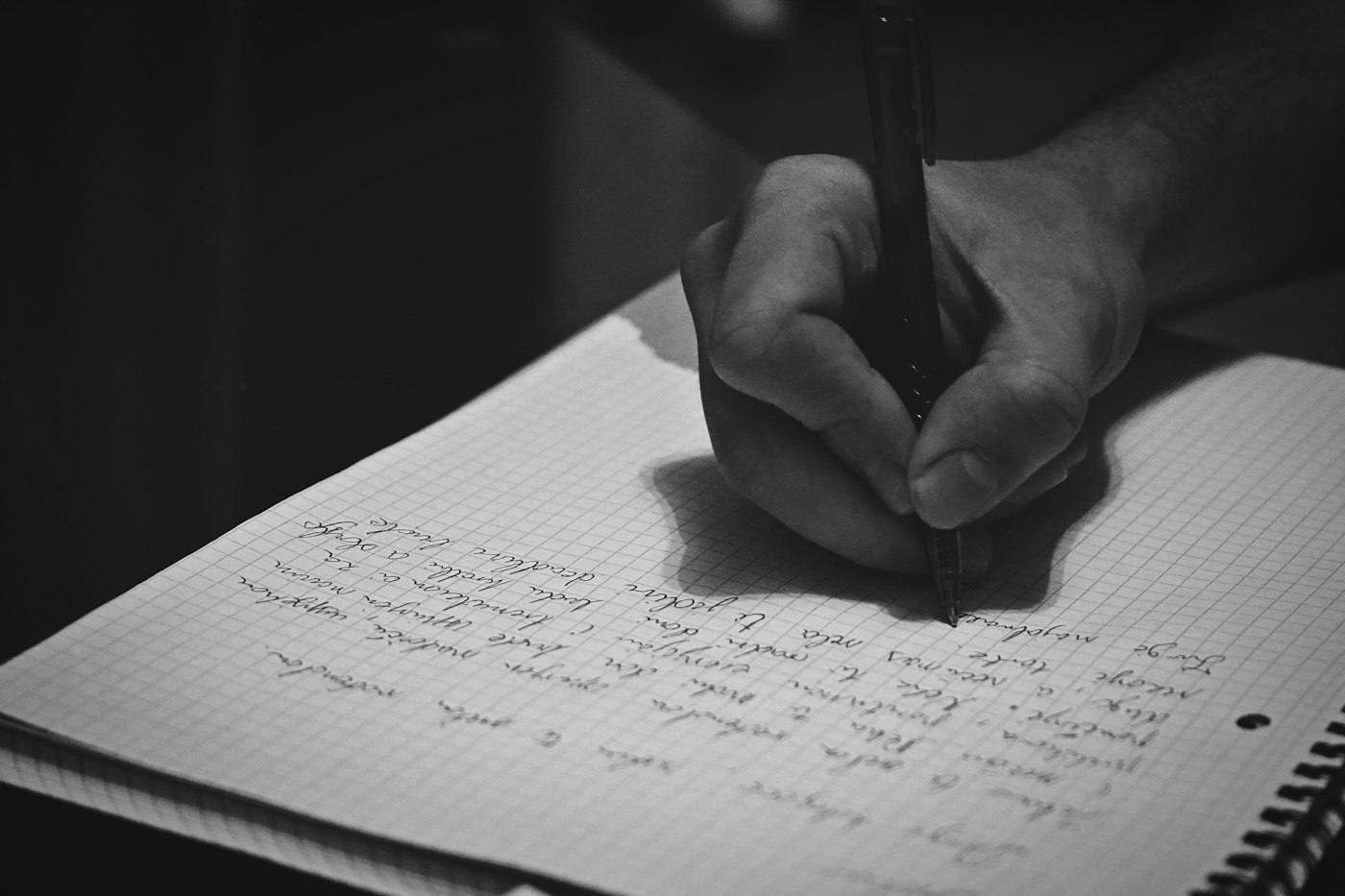
You draw individual letters with your finger, adjust the gaps between them, then export a font file. Once you load that file into a compatible design app, you can type new words using the letters you drew.
As of November 10, 2026, the US App Store lists Pocket at $9.99, with iOS 18 or later required. The maker describes a one-time purchase and allows commercial use of the fonts you create. Pocket is a separate app from Affont's desktop product and does not connect to Affinity.
Start with a vector brush: you draw an editable shape with a solid outline. Affont also offers textured brushes, but the maker warns that most iPhone apps show those letters as plain silhouettes. That chalky edge you liked in the drawing screen may disappear in the app where you lay out your card.
Pocket doesn't import letter sheets. Plan to redraw the letters on the phone, and test an exported font in your intended design app before spending an evening on it.
Where would a handwritten font help your shop?
For the Franklin bookstore, I'd try “staff picks” above a two-sentence recommendation. A rounded, uneven lowercase word could look lovely against a cream card. Keep the recommendation in your existing readable font, with enough space around it that a shopper can finish the sentence without leaning into the shelf.
You can still write the whole card by hand. The reusable font becomes useful when several employees need to make matching cards, or when you want the same heading on your website. I covered that division between expressive headings and reading text in our guide to choosing shop fonts.
A butcher in Noblesville could try the same approach with “house made” above a sausage description. I'd keep the product name and price in the shop's plain type. For an example label reading “$8.50/lb,” check that a customer can distinguish the decimal point and unit through the display glass.
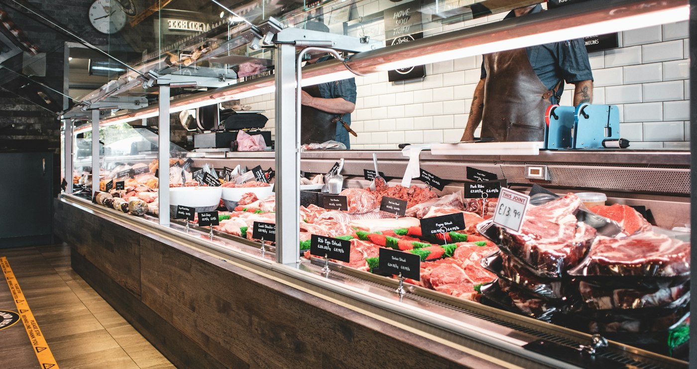
Keep the handmade lettering for a short heading, and let customers read the price without stopping to decode it.
How do you know the lettering is readable?
Print your sample at the size you'll use. Place it on the shelf or behind the counter glass, then stand where a customer stands. A beautiful loop can close up at that distance. Ask someone who hasn't watched you draw it to read the words aloud.
In Pocket's preview, type the phrase you intend to use. Adjust the space between awkward letter pairs, which designers call kerning. You want a customer to read “staff picks” as two words, without a stray gap that makes them pause inside one.
Then open your exported font in the app you'll use for the finished card. Check the saved PDF or image, too. Affont lists several export formats, including familiar TTF and OTF font files; that list alone doesn't confirm that your particular editor will accept the font or preserve its texture.
After you approve a card, save it as a reference. Write down which font you used for the small text and where you permit the handmade heading. That belongs in your small brand kit. For a website or brand project, I'd carry that same rule into the page designs so your booking instructions stay easy to read.
Try it on the shelf card you replace most often. Leave the good little wobble in the lettering if your customer can still read the word.
Sources
| # | Source | What it backed up |
|---|---|---|
| 1 | Affont Pocket launch announcement | November 7, 2026 announcement, drawing letters, spacing and export features. |
| 2 | Affont Pocket on the US App Store | $9.99 price and iOS 18 requirement, checked November 10, 2026. |
| 3 | Affont Pocket product guide | Brush and texture limits, commercial use, separate licensing and lack of letter-sheet imports. |
| 4 | Luminest: What your font is saying about your shop | Using different type for expressive headings and longer reading text. |
| 5 | Luminest: The smallest brand kit | Recording font choices so staff can reuse them. |